Market-Ready Packaging Mockups: How to Present Products for the US, EU, Canada, and Japan


Market-ready packaging concepts across skincare, beverage, coffee, and candle product formats.
A market-ready packaging mockup is not a legal label template. It is a presentation mockup that makes a product concept look credible for a specific market by showing realistic language, units, quantity placement, barcode style, recycling cues, safety copy, and compliance placeholders.
A coffee bag with no weight statement on the front. A skincare box with no ingredient panel anywhere visible. A beverage can showing the wrong volume unit for its supposed market. A candle label with no safety information at all. Each of those mockups can still look beautiful on a portfolio page — but on a client review call, the same details that are missing are the ones that make a brand owner pause.
That gap, between "this looks great" and "this looks like it could be on a shelf next month," is what market-ready packaging mockups are built to close.
A market-ready mockup shows how the same brand direction would adapt across different retail markets — for example, the United States, the European Union, Canada, or Japan. The work goes deeper than swapping the logo color or translating one headline. The mockup also reflects local cues: language, units, label hierarchy, barcode style, information panels, warning sections, even the visual mood of the product photo. The brand stays consistent; the packaging culture changes.
A quick note before going further. The examples in this guide are presentation-focused mockup concepts inspired by real-world packaging differences. They are not legal packaging templates. Before any artwork goes to print or production, the final files should be reviewed against local regulations by a qualified packaging or compliance specialist.
With that out of the way: for designers, this approach is useful because it gives a client more than a render. It gives them a sense of how the brand would feel in each market — which is usually what they were trying to articulate when they asked to "see it global."
How this guide was created
The Creatsy team built original market-ready mockup concepts for four product categories: coffee bags, skincare cream packaging, beverage cans, and candle labels. The market notes were cross-checked against public resources from the FDA, the European Commission, CFIA, CAA Japan, Health Canada, JCIA, and the candle safety references listed at the end of this article. Everything below is intended for design presentation and education — not as final compliance artwork.
What makes a mockup market-ready?
The shorthand: a market-ready mockup uses the same kind of visual details a brand owner expects to see on real packaging. That usually means some combination of:
local language and typography hierarchy
metric, imperial, or bilingual quantity statements
nutrition, ingredient, direction, warning, or product information panels
barcode placement that matches the region (UPC, EAN, JAN)
recycling or safety icons used as visual placeholders, not as compliance claims
front, side, back, dieline, and lifestyle views built into the same system
an environment in the lifestyle scene that reads as native to the target market
The goal is not to turn the mockup into a legal document. The goal is to give clients enough visual context that the presentation feels like a strategy, not a render.
Why compare the US, EU/Germany, Canada, and Japan?
These four markets create strong visual contrast at a glance. They differ in language, units, information density, and overall packaging design culture — which is exactly what makes them useful as a comparison set in a client deck.
Market | What changes visually | Best mockup cues to show |
|---|---|---|
United States | English copy, US customary units, bold retail layout, UPC-style barcode | NET WT / fl oz statement, Nutrition Facts for beverages, distributor block, commercial lifestyle scene |
EU / Germany | German copy, metric units, structured information, EAN-style barcode | g, ml, ℮ mark where valid, Nährwerte pro 100 g/ml, INCI, responsible person, minimalist layout |
Canada | English + French, metric units, bilingual warnings and product identity | Ingredients / Ingrédients, Warnings / Mises en garde, bilingual front label, balanced layout |
Japan | Japanese text, compact information hierarchy, metric units, JAN-style barcode | 原材料名, 内容量, 使用方法, 販売者, dense but elegant label blocks |
1. Coffee bag mockups
Coffee packaging is one of the clearest products for this kind of work because it naturally carries roast type, origin, weight, batch number, storage notes, barcode, and side-panel information, with ingredient or nutrition details added where the real product and market require them. A generic coffee bag mockup might stop at logo and product name. A market-ready version shows how the same brand direction adapts when the bag has to live in a different shelf context.
The previews in this section were built with the Coffee Bag Mockup Set.
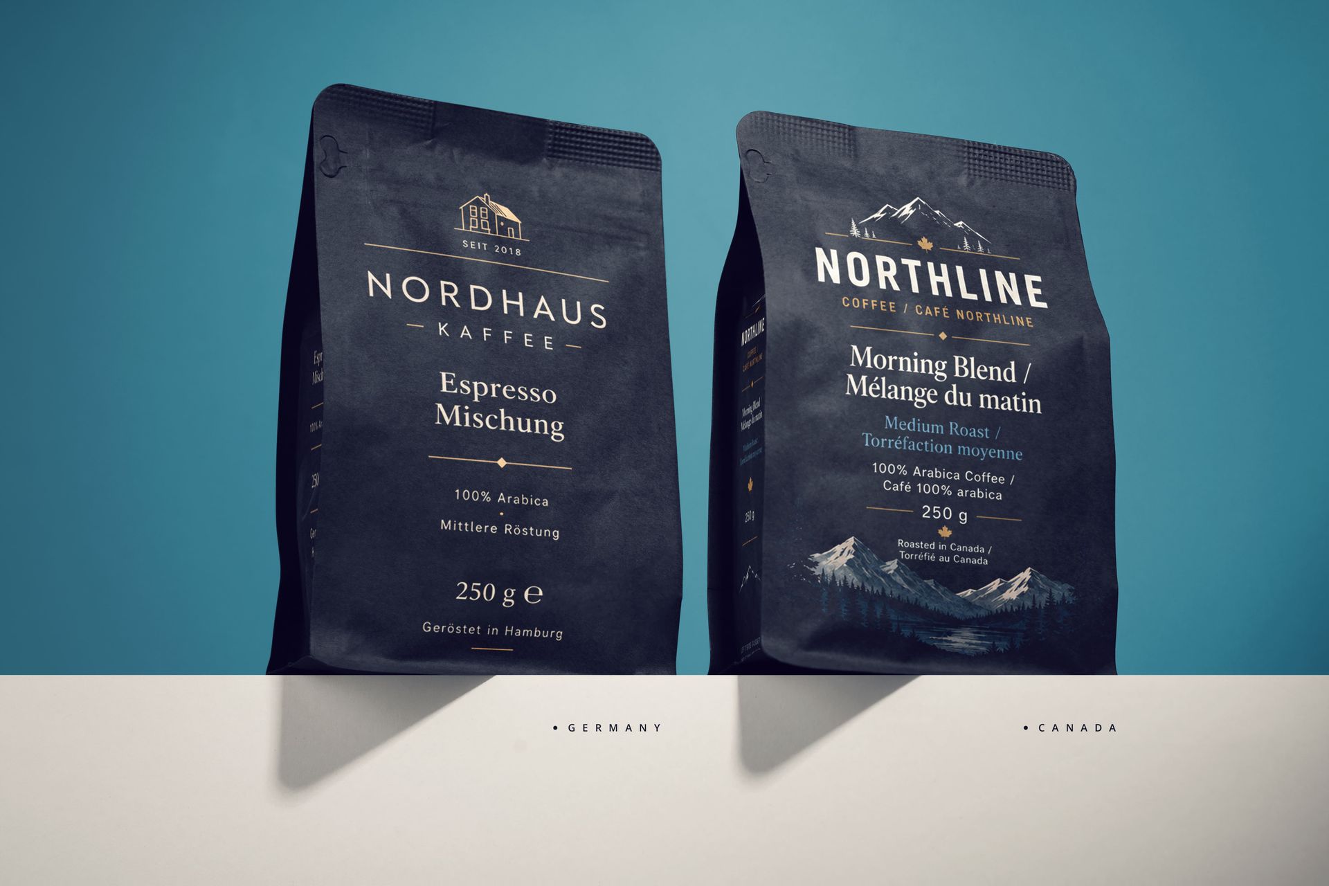
Coffee bag market versions: EU/Germany and Canada. The same black pouch format is adapted through language, hierarchy, and market-specific information cues.
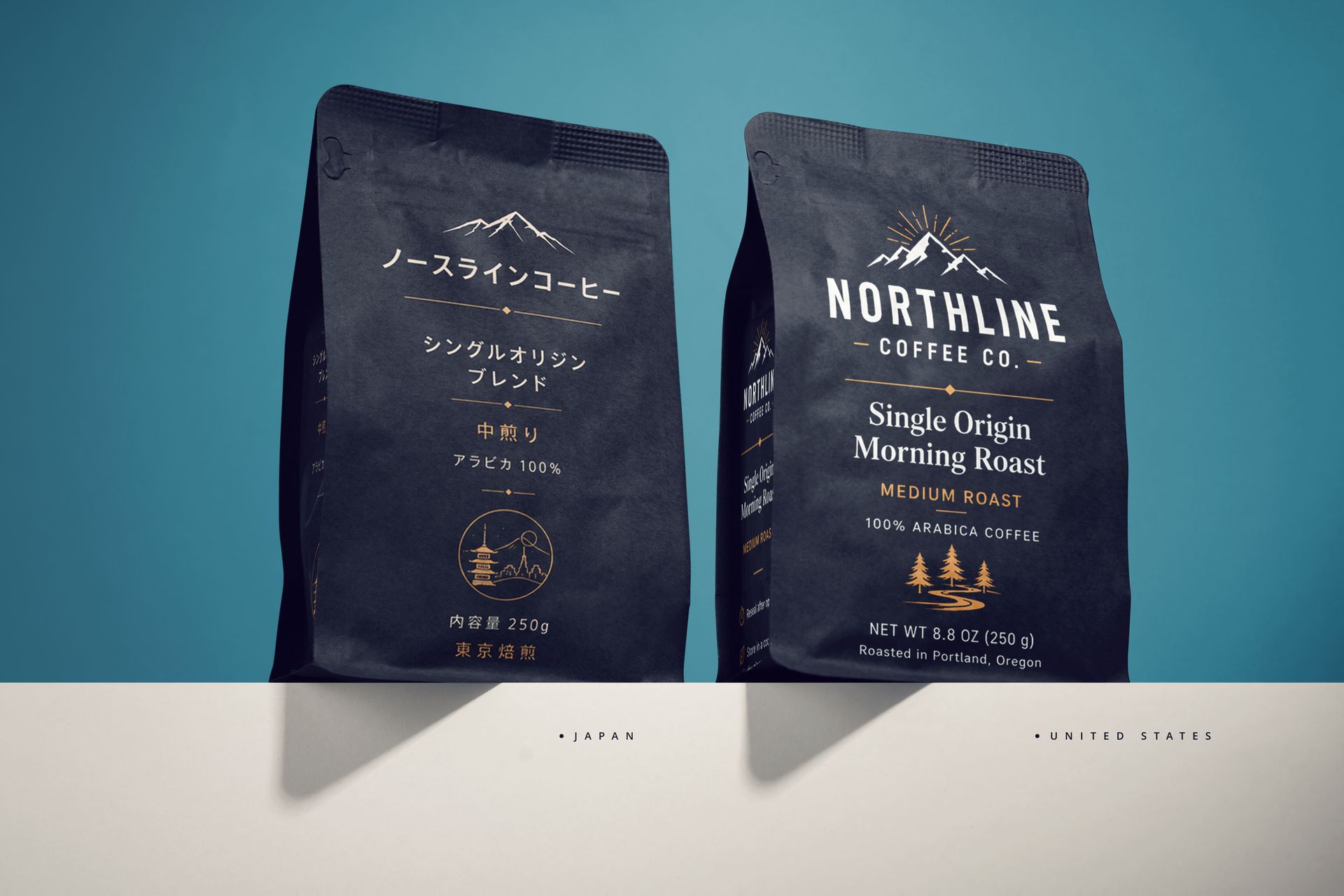
Coffee bag market versions: Japan and United States. The physical pouch stays consistent while label language, information density, and visual style change.
A compliance note before the market versions: for plain roasted coffee, it's worth being careful not to present a Nutrition Facts panel as universally required. FDA guidance notes exemptions for coffee beans and ground coffee in certain contexts, and EU nutrition rules have their own exemptions for some foods. For mockup presentations, a product information panel works better than a forced nutrition declaration unless the real product and market call for one. That keeps the concept realistic without overclaiming compliance.
The US version
For the US version, English-only copy with a bold retail hierarchy works best. The front quantity statement reads NET WT 8.8 OZ (250 g) — keeping the same physical 250 g pouch across all four versions makes this a simple unit conversion. On the side panel, designers usually fit ingredients, roasted date, best-by date, batch number, and a distributor block, with a UPC-style barcode anchored cleanly to the bottom edge.
For the lifestyle scene, think bright kitchen light, a mug in frame, breakfast cues — the kind of commercial brightness that signals "grocery shelf" without trying too hard.
US note: final packaging may also need review under the Fair Packaging and Labeling Act, state-level rules, and retailer requirements. For future-facing food and beverage mockups, designers should also watch the FDA’s proposed front-of-package “Nutrition Info” box — still a proposed rule, but one that would apply to many foods if finalized.
The EU / Germany version
Switch to German-forward copy, metric quantities, and a noticeably more structured layout. The front shows 250 g ℮, with side-panel blocks for Zutaten, Mindesthaltbar bis, Chargen-Nr., and Aufbewahrung, plus an EAN-style barcode. Skip any unverified claims like Bio or official certification marks — they don't belong on a mockup unless the real product is genuinely certified.
For the scene: stone, ceramic, linen, soft daylight. Restrained premium minimalism reads as European more reliably than any single graphic flourish.
EU regulatory note: the Packaging and Packaging Waste Regulation (EU) 2025/40 entered into force on 11 February 2025 and will generally apply from 12 August 2026. For mockup work, this means EU-facing packaging concepts should leave realistic space for material, recycling, reuse, and waste-related cues instead of treating those details as optional decoration.
EU coffee note: coffee is also covered by the EU Deforestation Regulation. This is not a decorative label mark to fake in a mockup, but brands selling coffee into the EU should be aware of due-diligence expectations and timeline-sensitive sourcing claims. As of the current EU timeline, the entry into application is 30 December 2026 for large and medium operators and 30 June 2027 for micro and small operators.
The Canada version
Canada is where bilingual hierarchy starts mattering. Use balanced English and French copy across the front and side panels, with metric quantity (250 g), bilingual product identity, and storage information. The side panel pairs Ingredients / Ingrédients, Best before / Meilleur avant, Lot / Lot, plus a barcode.
A calm North American setting with wood, natural light, and subtle outdoor-inspired details fits the visual style of most Canadian specialty coffee brands without leaning on stereotype.
Québec note: for Canadian mockups, bilingual hierarchy is not just a nice visual cue. Since 1 June 2025, Québec rules require certain generic and descriptive terms shown with a non-French trademark to also appear in French on the product or its permanent support. For national Canadian packaging concepts, the French hierarchy should be planned from the grid stage, not squeezed in at the end. A transition period applies until 1 June 2027 for certain products manufactured before 1 June 2025, under specific trademark-registration conditions.
The Japan version
Japanese copy as the primary language, with 内容量 250g on the front and compact side-panel blocks: 原材料名, 保存方法, 賞味期限, 販売者, and 栄養成分表示 where appropriate. A JAN-style barcode and a tight, precise layout finish the system.
Style-wise, the scene works best with quiet café energy — warm wood, controlled lighting, restraint over decoration. Information density on the label is high, but it should feel organized through grid discipline, not crowded.
Recommended Creatsy mockups for this section
Coffee Bag Mockup Set — multi-angle layered PSD with editable Smart Object label zones
Coffee Bag Flat Lay Mockup Set — a flat-lay coffee bag presentation option
Free Coffee Packaging Pouch with Scoop Branding PSD Mockup — free PSD if you want to test the workflow before committing to a full set
2. Skincare cream mockups
Skincare is the strongest category for showing detailed market-ready differences. It combines a premium product look with practical label information — ingredients, directions, warnings, net quantity, distributor details, batch number, barcode, and the outer box panels that go with each of those.
The previews in this section were built with the Cream Glass Jar and Unfolded Box Mockup and the Spotlight Cream Jar with Spatula Mockup.
United States | EU / Germany |
Canada | Japan |
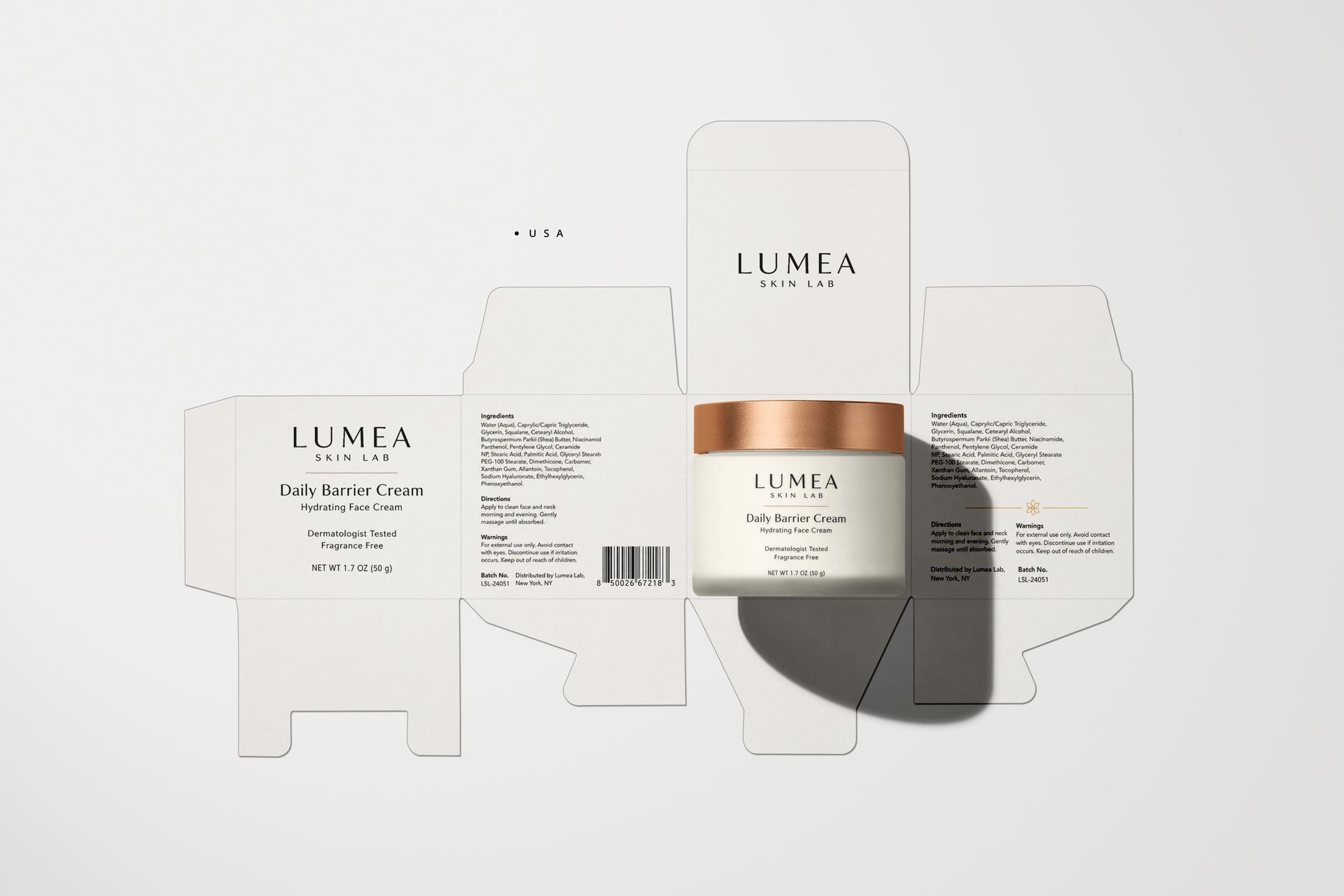
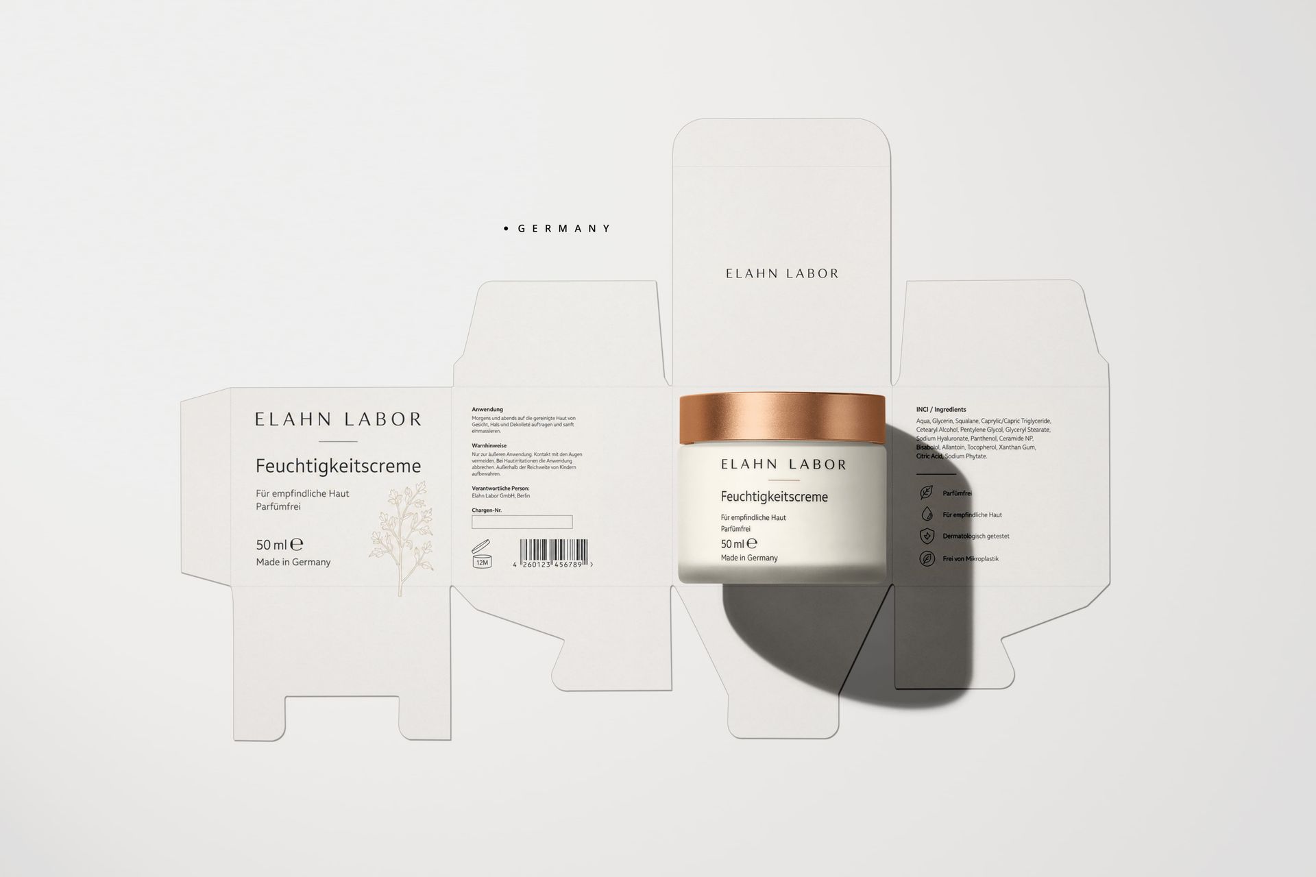
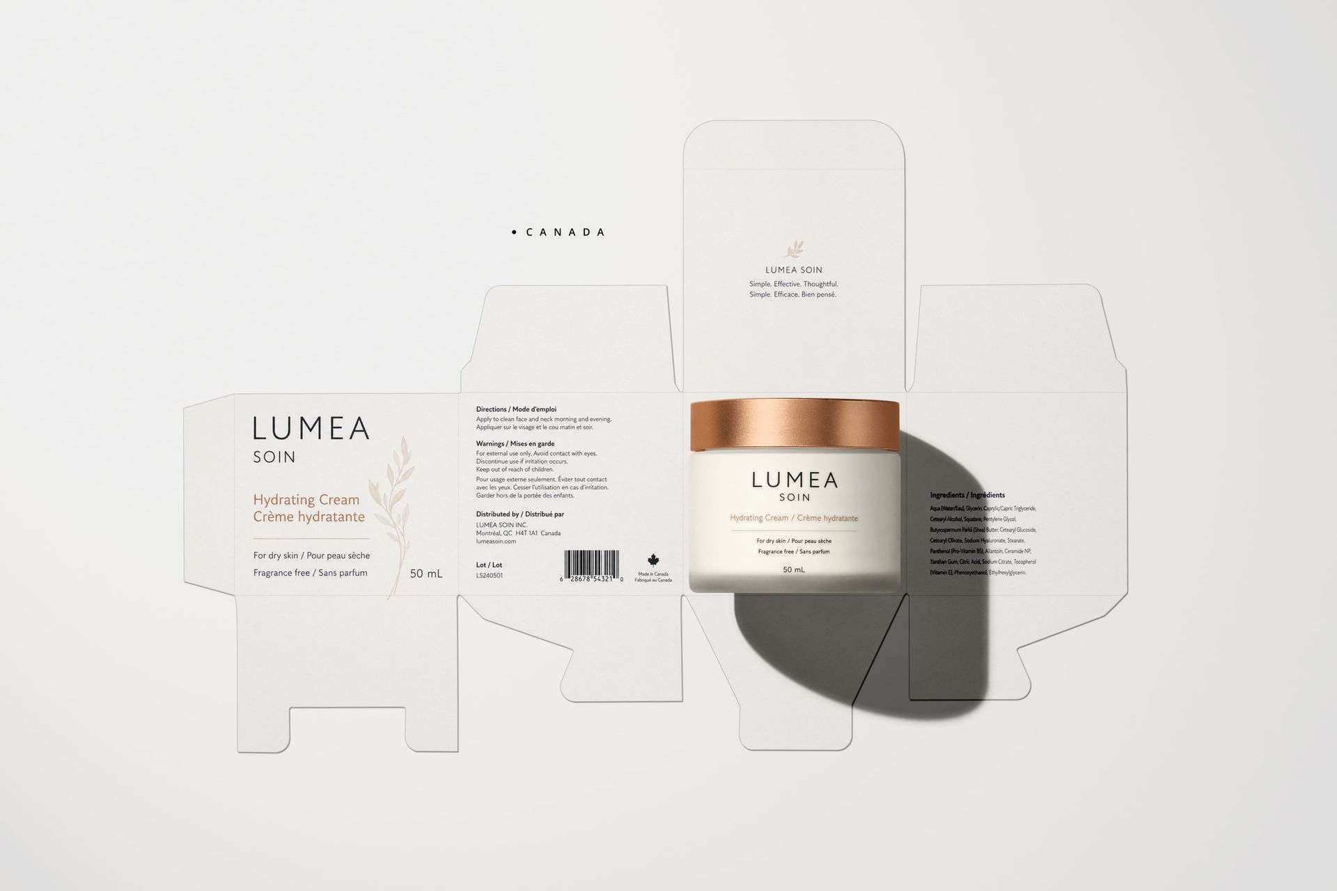

Skincare cream packaging shown as a market-ready grid for the US, EU/Germany, Canada, and Japan, including jar, box, and dieline-style artwork cues.
United States | EU / Germany |
Canada | Japan |


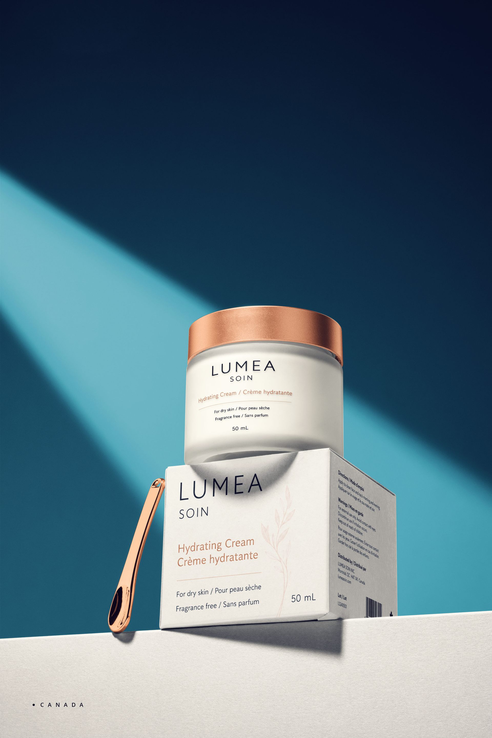

Lifestyle skincare mockups: the same cream jar and box format is adapted through local copy and market-specific label structure.
The US version
English-only front label copy with a US-style net quantity statement (NET WT 1.76 OZ (50 g)). On the box side or back, designers normally fit ingredients, directions, warnings, distributor information, batch number, and a UPC-style barcode.
One thing worth flagging in the brief: avoid drug-like claims unless the product has actually been reviewed for that use. Keep the mockup in cosmetic presentation territory. A scene with clean vanity lighting, glass shelf reflections, and a calm beauty-counter mood reads as US retail without straining for it.
The EU / Germany version
German copy, metric units, and a structured minimal information layout. The label shows 50 g ℮, INCI / Ingredients, Anwendung, Warnhinweise, Verantwortliche Person, Chargen-Nr., a PAO icon, and an EAN-style barcode.
The responsible-person block is one of the clearest visual cues that a cosmetic mockup is meant for the EU, even before a viewer reads a single word of copy. Pair it with a restrained apothecary-inspired design system — clean typography, generous negative space, no decorative ingredient claims.
The Canada version
Bilingual English/French for product identity, directions, and warnings. Use 50 g as the quantity and keep the INCI list clearly organized rather than wedged in wherever it fits. The side panel pairs Distributed by / Distribué par, Lot / Lot, and a barcode.
The trick here is making the bilingual hierarchy feel intentional. When it's planned from the layout grid up, the result reads as designed; when it's added late, it reads as cramped.
The Japan version
Japanese as the main language, with a compact and precise hierarchy. The label carries 内容量 50g, 全成分, 使用方法, 使用上の注意, 製造販売元, ロット番号, and a JAN-style barcode.
Visually, this version benefits from a refined quiet-beauty system: small but organized text blocks, dense information handled through spacing and grid discipline, calm imagery. It's the version that most rewards careful typesetting.
Japan skincare note: Japanese cosmetics fall under the PMD Act, and the Japan Cosmetic Industry Association publishes the Japanese ingredient names used for cosmetic ingredient labeling. A Japan-market skincare mockup should not look like an English label with a stray Japanese heading — the ingredient block and product copy should read as genuinely Japanese.
Recommended Creatsy mockups for this section
3. Beverage can mockups
Beverage cans are the fastest category for visual comparison because volume, language, nutrition panels, barcode placement, and recycling or deposit cues are all easy to spot at a glance. For this project, the can is intentionally fixed at a standard 330 ml format so the same Creatsy can mockup supports all four market versions without re-rendering geometry.
The previews in this section were built with the Fizzy Underwater Soda Cans Collection Mockup.
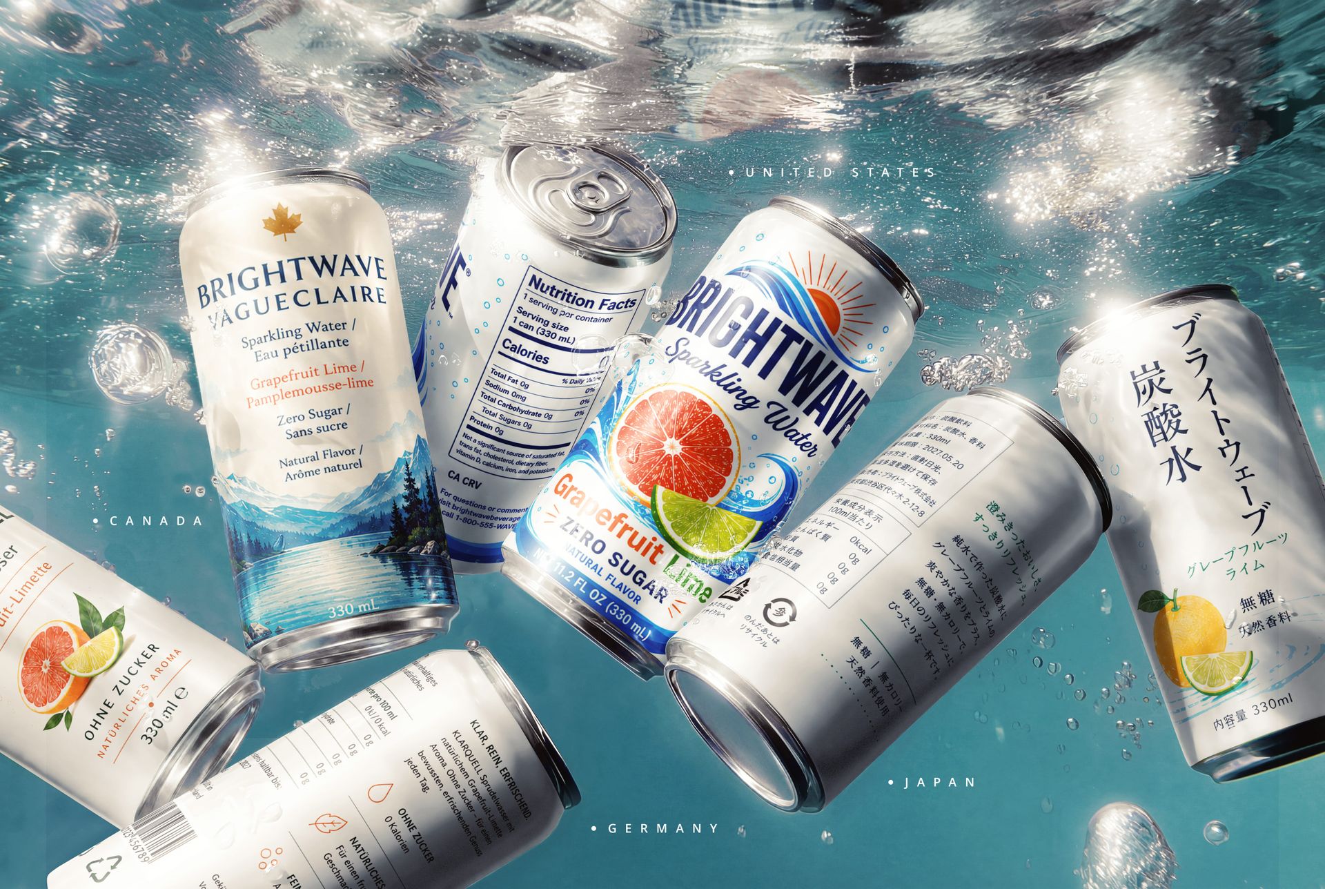
Beverage can market-ready concept: the same 330 ml can format is adapted for Canada, Germany, the United States, and Japan.
The US version
The physical can stays at 330 ml, but the front-of-can copy reads NET 11.2 FL OZ (330 mL) for the US audience. English-only front copy, a UPC-style barcode, and, where required, a US-style Nutrition Facts panel finish the label.
Visually, US beverage design tends toward bold graphics, high contrast, and condensation or ice in the lifestyle scene. One thing to avoid: copying real beverage brands or recognizable trademarked layouts. A market-ready mockup is a strategy tool, not a parody.
The EU / Germany version
German copy, metric quantity, and a cleaner structural label. Include 330 ml ℮, Zutaten, Nährwerte pro 100 ml, Mindestens haltbar bis, Pfand where applicable, and an EAN-style barcode. The Pfand (deposit) cue is one of the most German visual signals a beverage can carry — even small, it shifts the read of the entire label.
Color restraint, negative space, and a modern European refreshment scene work better here than the bolder US treatment. Skip any official certification marks unless the real product is certified.
The Canada version
Bilingual English/French for product identity and claims, 330 mL as the quantity, and a bilingual Nutrition Facts / Valeur nutritive panel where appropriate. The label pairs Ingredients / Ingrédients, Best before / Meilleur avant, Distributed by / Distribué par, and Recycle / Recycler.
The scene tends to read most naturally with a calm North American feel — wood, ice, citrus, soft daylight, subtle outdoor cues. The bilingual layout is what does most of the heavy lifting.
Canada regulatory note: from 1 January 2026, many prepackaged foods high in saturated fat, sugars, or sodium must carry the bilingual front-of-package nutrition symbol on the principal display panel. For beverage and food mockups, reserve clean front-label space for the “High in / Élevé en” symbol when the product profile requires it.
The Japan version
Japanese text, 内容量 330ml, and compact product information blocks: 原材料名, 賞味期限, 保存方法, 販売者, 栄養成分表示, and a JAN-style barcode.
Aesthetically, this version works well with a premium convenience-store or design-led café feel. The label stays information-rich but disciplined — a lot of words, very little visual noise.
Japan packaging note: Japanese mockups should not rely only on translated product copy. Depending on the material and format, packaging may need local identification marks such as プラ for plastic containers and packaging, 紙 for paper containers and packaging, PET marks, or can-material marks. These details are small, but they strongly affect whether a Japanese-market mockup feels real.
Recommended Creatsy mockups for this section
Can Mockup Set — multi-can group shot for shelf-style presentations
4. Candle label mockups
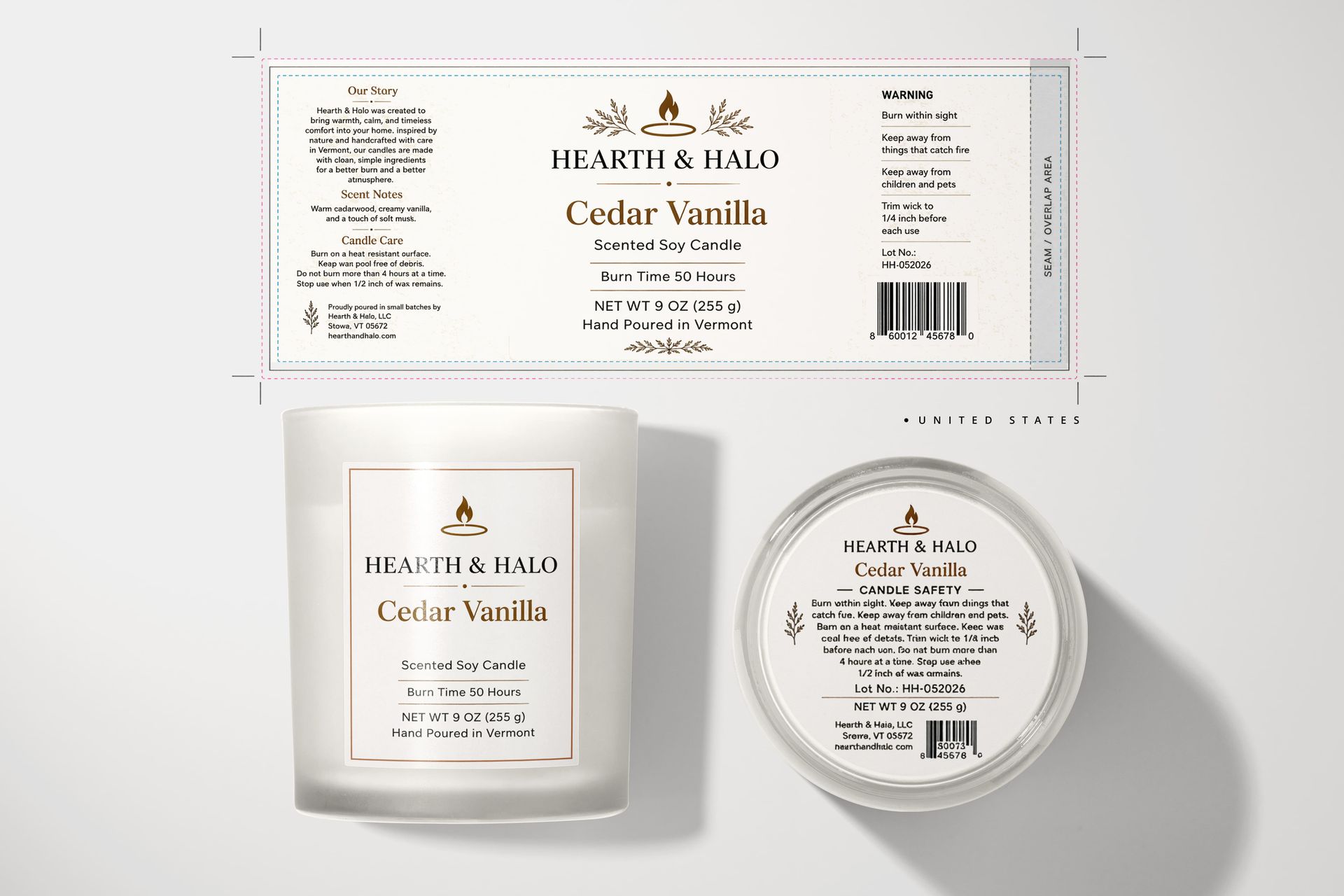
Candles are less information-heavy than food or cosmetics, but they're still strong for market-ready presentation because warning labels, weight, scent naming, barcode placement, and lifestyle styling vary noticeably by market. For this project, the vessel is fixed at a 9 oz clear glass jar — same physical size across all versions.
The previews in this section were built with the Frosted Glass Candle Mockup Set.
United States | EU / Germany |
Canada | Japan |
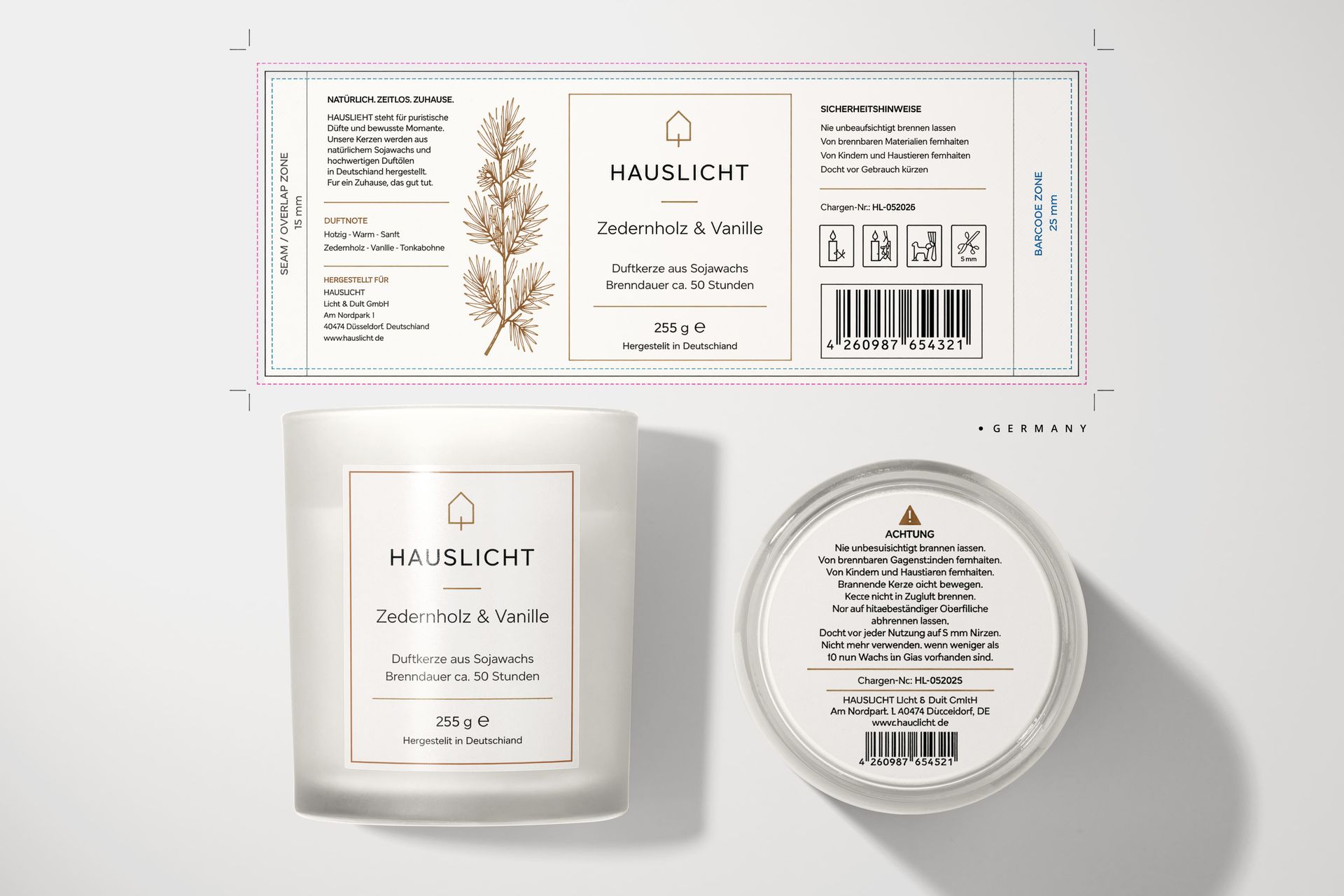
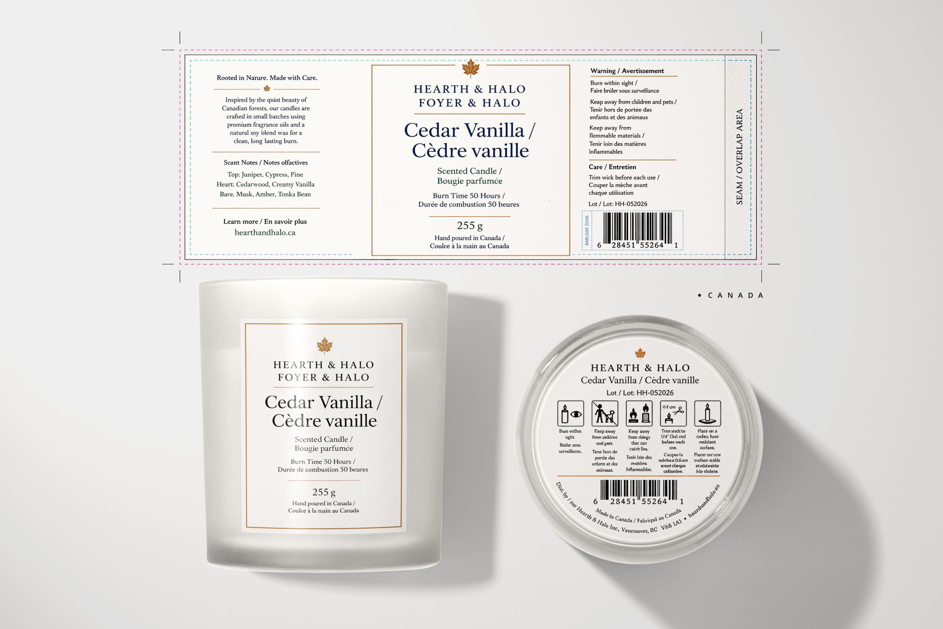
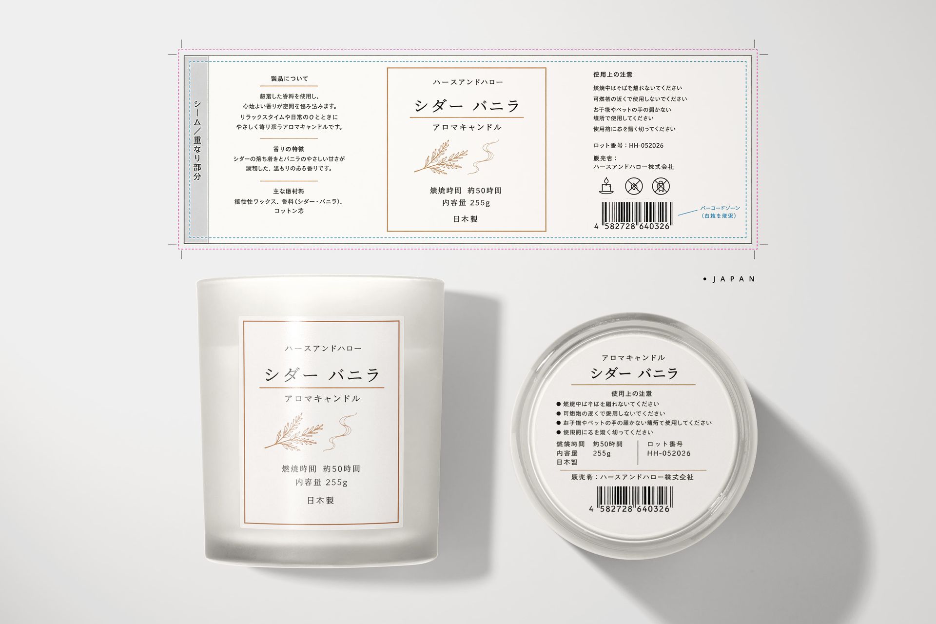
Candle label systems for the US, EU/Germany, Canada, and Japan. Each version uses the same 9 oz jar format with localized label language and warning cues.
A small caveat before the versions: candles are also a category where many of the buyers are independent makers selling through their own storefronts or marketplaces. The mockups in this section are built for presenting your own original designs — listing photography, brand decks, ecommerce hero images. They are not intended for use as the final printed label artwork or as the product itself.
The US version
English-only copy, a warm giftable design, and a front quantity statement of NET WT 9 OZ (255 g). The label carries burn time, scent name, hand-poured location, a UPC-style barcode, batch number, and a warning panel.
Common US candle-warning copy often follows the National Candle Association's three core safety rules: Burn within sight, keep away from combustibles, and keep away from children. Brands may add pet-specific wording as an additional safety cue, but it should not be treated as the core NCA phrasing. For the lifestyle scene, warm home decor, wood, textiles, and cozy evening light read as the natural US gift-store environment.
The EU / Germany version
German copy, 255 g ℮, and an understated design-led layout. The label includes Sicherheitshinweise, Chargen-Nr., an EAN-style barcode, and small generic safety pictogram-style icons.
Important: don't drop fake CLP or certification icons onto the mockup. If the real product hasn't been reviewed for those marks, use placeholder-style line icons instead, and note them as such in the label legend. Stone, linen, ceramic, neutral colors, and restrained light suit the visual language of most European premium candle brands.
EU candle note: scented candles, wax melts, and reed diffusers may fall under CLP labeling when the fragrance or wax mixture is classified as hazardous. In that case, final packaging may need GHS pictograms, a signal word, hazard statements, precautionary statements, and potentially a UFI code. In presentation mockups, do not invent CLP marks unless the real mixture has been classified.
The Canada version
Bilingual English/French for product identity, warnings, and care instructions, with 255 g as the quantity. The label pairs Burn Time / Durée de combustion, Warning / Avertissement, Care / Entretien, and Lot / Lot.
A cozy modern-cabin or calm winter-home environment with wood, wool, ceramic, and natural light gives the scene the right tone. Balance the bilingual hierarchy so the layout feels designed, not crowded.
The Japan version
Japanese text, 内容量 255g, and compact safety and product information blocks: 使用上の注意, ロット番号, 販売者, and a JAN-style barcode.
Visually, the Japan version sits well in quiet, minimal, refined interiors — wood, ceramic, controlled soft light. Small text handled through careful spacing keeps the design calm and precise.
Recommended Creatsy mockups for this section
How to build a stronger packaging presentation
A strong market-ready presentation doesn't need dozens of scenes. It needs the right scenes, arranged in a way that helps the client make a decision.
Most of the decks that land well follow a similar shape. There's a front hero mockup — the image clients react to first, usually the one that ends up on the cover slide. Next to it sits a side or back panel view that shows the actual information density: ingredients, warnings, nutrition, barcode, batch number, distributor block. After that, a flat label, can wrap, pouch layout, or box dieline view proves that the design system works beyond the front panel. A lifestyle scene with environment, light, and props pulled from the target market grounds everything in context. And finally, a four-market comparison grid — US, EU, Canada, Japan — communicates the strategy faster than any explanation slide ever will.
For PSD-based workflows, this whole sequence is built off one source file with Smart Object zones for the label artwork. Edit the label, render four scenes, drop them into the deck. The same file that produced the US hero produces the Japan version twenty minutes later.
Practical design tips
Keep the brand system consistent
The market details should change, but the brand should still feel like the same brand. Logo, core typography, visual motif, color logic, product positioning, material feel — those stay. What changes is language, units, panel hierarchy, barcode style, information blocks, warning copy, and scene styling. When clients see the same brand survive four different markets in one deck, the system itself starts to feel like the value.
Don't overclaim compliance
Use phrasing that signals "design preview" rather than "ready for production." Phrases like market-inspired label layout, localized presentation concept, example information panel, or for design preview only keep the work honest. Mockup copy presented as final legal labeling, when it hasn't been professionally reviewed, is the fastest way to lose a client's trust after the project ships.
Avoid fake certification marks
Official certification marks, organic seals, safety seals, and government marks belong on packaging only when the product genuinely has them. For mockups, neutral placeholder icons or clearly editable icon layers do the same job without the legal risk. If the client is presenting the deck to retail buyers, a fake seal is the kind of detail that gets noticed. The same logic applies to the ℮ mark: treat it as a regulated placeholder, not a decorative European detail — it should only appear on final packaging when the real product, fill process, and documentation support EU nominal-quantity rules.
What to treat as placeholder vs. what not to fake
Use mockup label details as presentation cues, not compliance marks. Barcodes, recycling symbols, certification marks, ℮ marks, deposit marks, hazard icons, importer data, and regulatory seals should be treated as placeholders unless they are verified for the actual product and market.
For Canada, Germany, and Japan, localized packaging mockups should also be proofread by a native speaker or compliance reviewer. Small wording mistakes in French, German, or Japanese can make a mockup feel less credible even when the visual design is polished.
Make text editable
The most useful PSD mockups aren't only the most beautiful ones — they're the ones a designer can actually adapt without rebuilding the file. Smart Object label zones, organized layer groups, changeable backgrounds, editable shadows, separate front and side label slots — those structural choices are what let a single mockup support a US, EU, Canada, and Japan version in the same afternoon. (Most Creatsy PSDs are built with that workflow in mind: 300 DPI layered files with named Smart Object zones for the label artwork. Many of them also open and edit in Photopea via Smart Object workflows, though some advanced Photoshop-specific effects may render differently, so it's worth testing the final export before publishing.)
Which product should you start with?
If the goal is the clearest demonstration in a single deck, skincare or coffee tends to give the most readable contrast. Skincare carries the most visible regulatory-style differences across US, EU/Germany, Canada, and Japan. Coffee is simple enough that a non-designer client understands the comparison instantly, while still carrying enough information to show real localization. Beverage cans are best when speed of visual comparison matters more than label density. Candles are the natural fit for home fragrance brands and boutique product lines presenting their own original artwork.
Build a market-ready packaging presentation
A good mockup shows what a design looks like. A better mockup shows how that design could live in the real world.
Market-ready packaging mockups give designers a way to present brand systems with more context: not just a logo on a pouch, but a product that feels ready for a shelf, a pitch deck, an ecommerce launch, or a client review. By showing the same coffee bag, skincare cream, beverage can, or candle across the US, EU/Germany, Canada, and Japan, you give clients something more useful than a beautiful image — you give them a clearer decision.
Browse Creatsy packaging mockups, skincare mockups, beverage mockups, and candle mockups to build presentations that feel polished, realistic, and ready for the market. All Creatsy files are layered 300 DPI PSDs available through a one-time license — no subscription, no per-render limits.
Market requirements at a glance
Requirement | US | EU/Germany | Canada | Japan |
|---|---|---|---|---|
Primary language | English | German / local language | English + French | Japanese |
Quantity style | US customary + metric | Metric, ℮ only when valid | Metric, bilingual context | Metric with Japanese label text |
Food nutrition | Nutrition Facts, exemptions apply | Per 100 g/ml nutrition declaration | Nutrition Facts + FOP symbol if high-in | Japanese nutrition labeling for applicable foods |
Cosmetics | Identity, net quantity, business name/address, no drug claims | Responsible Person, INCI, PAO / min durability, batch | INCI, bilingual warnings/directions where required | Japanese ingredient names / PMD Act context |
Recycling / deposit cues | State / category-specific | PPWR, national systems, Pfand where applicable | Federal / provincial / EPR context | プラ, 紙, PET / can marks where applicable |
Candle warnings | NCA / ASTM-style safety copy | EN / CLP context where applicable | Health Canada-style safety language | Japanese safety copy; no fake mandatory candle seal |
FAQ
What are market-ready packaging mockups?
Market-ready packaging mockups are product mockups that show packaging designs with the visual cues of a specific market — language, units, label structure, barcode style, and product information panels. They're presentation tools designed to help a client visualize how a brand would adapt across regions, not legal compliance templates.
Are these mockups legally compliant label templates?
No. They are design-presentation tools, not legal compliance templates. Use them to communicate market-specific packaging direction, then have the final packaging artwork reviewed against local regulations by qualified specialists before production.
Which products work best for market-ready mockups?
Packaging types with visible information panels carry this kind of work best: coffee bags, food pouches, skincare boxes, cosmetic jars, beverage cans, supplement-style packaging, and candle labels. The more label real estate a product has, the more market detail you can show.
Can I use one mockup format across all four countries?
Yes, as long as the physical product format stays the same. One 330 ml can mockup, for example, can support US, EU/Germany, Canada, and Japan label designs because the can geometry doesn't change — only the label artwork inside the Smart Object zone does.
Can I edit Creatsy PSD mockups in Photopea?
Many of them, yes — including the Smart Object workflows that most of these market-ready labels rely on. Photopea is a free browser-based editor that handles a large share of the Photoshop PSD feature set. Some advanced Photoshop-specific effects (certain blending modes, complex filters) may render differently, so it's worth testing your final export at full resolution before publishing.
Can I use these mockups for Etsy, Printify, or other POD listings?
Yes — for presenting your own original designs in listing photos, marketing visuals, and brand decks. Creatsy mockups are intended as a presentation layer for your artwork. They are not intended to be sold as the final product itself, used as the printed product design, or used in ways that go beyond what the license covers. Always check the license that came with the file you're using.
Related topics: market-ready packaging mockups, coffee bag mockups, skincare packaging mockups, beverage can mockups, candle label mockups.
Source notes and external references
Market notes in this guide were cross-checked against the public resources below. These mockups are presentation concepts, not legal packaging templates — always have final artwork reviewed against local regulations by a qualified specialist before production.
FDA — Food Labeling Guide PDF (coffee/tea nutrition labeling exemptions)
European Commission — Cosmetics legislation and responsible person
Japan Cosmetic Industry Association — General matters / full ingredient labelling
National Candle Association — Understanding the candle label
European Commission — Packaging and Packaging Waste Regulation (PPWR)
Office québécois de la langue française — Trademarks on products
European Commission — Classification and labelling (CLP/GHS)
METI Japan — Identification marks for plastic and paper containers and packaging
European Union — The ℮-mark: quantity information for prepackaged products