Creatsy After Dark 2026: The Winners and the Worlds They Created


A shared Halloween table, ten finalists, and collections that travelled from party plates to patterned walls. Here are the designs, details and stories behind Creatsy After Dark.
“Maths are scary, tattoos hurt and ghosts are just misunderstood.”
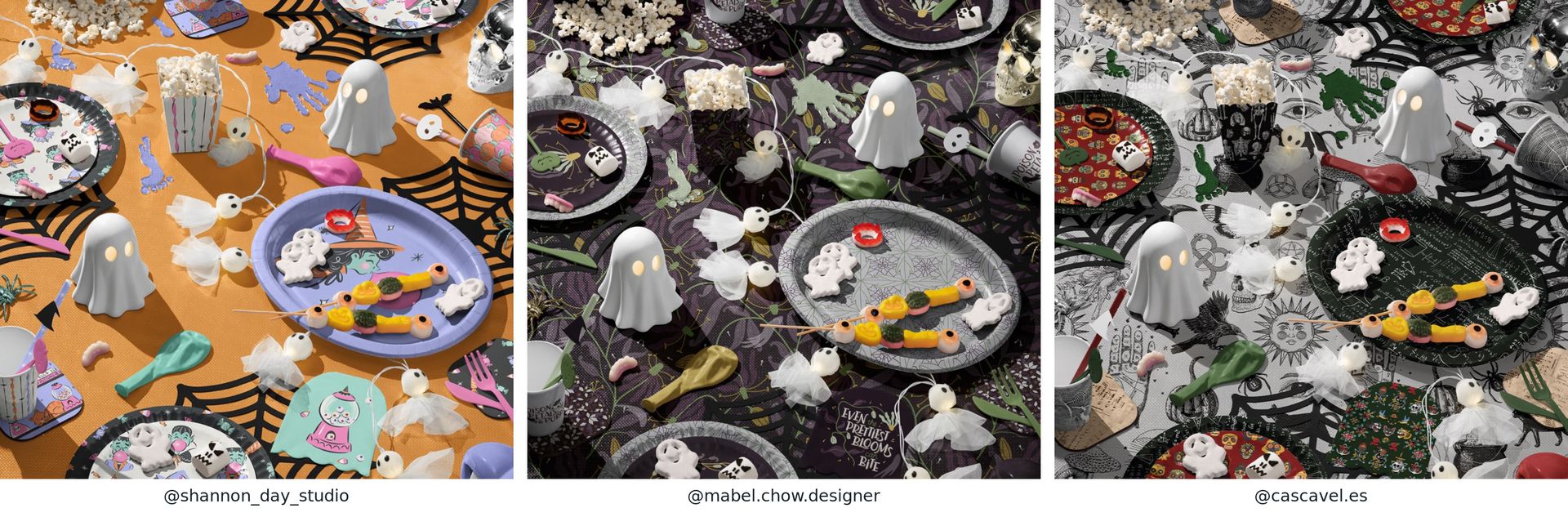
That was @cascavel.es's explanation for a Halloween table with mathematical formulas on the plates and tattoo-like illustrations across the cloth. It was also a good introduction to the range of ideas that arrived for Creatsy After Dark.
Elsewhere, the artwork featured a bubblegum-blowing witch, an elegant botanical print, a room full of ravens, or a ghost who would rather stay under a blanket with a book. The black cat bowl spilling popcorn, glowing ghost decorations and spiderweb placemats were built into Creatsy’s mockup. The artists brought their own patterns, illustrations and colour choices to this shared setting.
For the 2026 challenge, we invited artists to present their own Halloween designs using our free Halloween Party Table Setting Mockup. Ten finalists then continued with the full Halloween Mockup Set, developing their selected collections across additional scenes. We awarded first, second and third place, along with a separate People’s Choice award.
The results give us plenty to celebrate. So do the stories behind them.
One Table, Many Kinds of Halloween
The first-round mockup gave everyone the same fixed table arrangement, with editable surfaces for their artwork. Plates could carry a large illustration, a tablecloth could hold an all-over pattern, and cups, napkins and popcorn boxes could introduce the coordinating prints.
The differences were visible immediately. @shannon_day_studio's Bubblegum and Broomsticks brought a playful witch and candy-coloured accents to the table. @mabel.chow.designer approached the theme through Dangerous in Bloom, with a dark botanical palette and the warning that even beautiful flowers can bite. @cascavel.es put a different kind of fright on the menu with those mathematical plates.
These entries also showed how much the supporting patterns mattered. A stripe could calm a busy illustration. A small repeat could make a paper cup feel connected to a large tablecloth. Repeating a colour in several places helped the eye move around a scene full of details.
The shared setting made those choices especially easy to see.
A New Setting for Artwork Already Waiting
Some of the most memorable captions described work that had been sitting quietly in a folder.
@therosenborgcompany introduced Pumpkin Hollow this way:
“This is Pumpkin Hollow, a small hand-drawn collection which has been hiding in my files for ages, and this mockup finally gave it the stage it deserved!”
For @guidedbylightart, working with an existing collection had a more personal meaning:
“I haven’t been able to do much artwork in quite some time, so this felt like a really lovely way to reconnect with old artwork again.”
Both captions describe something a finished mockup can make possible: a fresh look at work its creator already knows well. A familiar drawing takes on a different character when it wraps around a cup or becomes the centre of a place setting.
There were new experiments too. @iulandia.studio shared that three out of seven mischievous cats had made it through their vector treatment in time for the challenge. @debgarlickstudio described entering a competition like this for the first time and tackling the complexity of such a busy composition.
The captions let us see some of the decisions, unfinished ideas and small victories behind the polished images.
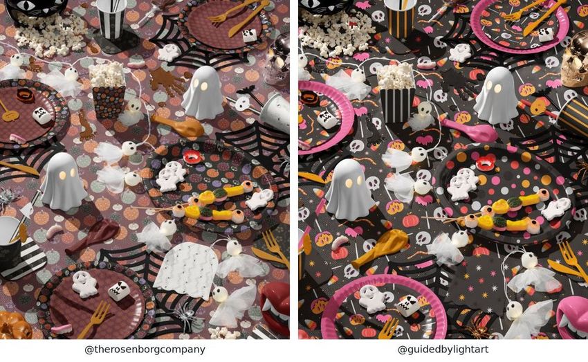
Existing artwork, a new setting: Pumpkin Hollow by @therosenborgcompany and a return to an earlier collection by @guidedbylightart. Mockups by Creatsy.
The Final Round: Giving a Collection Room to Grow
Each finalist received the full Halloween Mockup Set and was asked to present the collection that earned them a place in the final across three scenes of their choice.
That opened up a different set of decisions. A small motif could become a framed illustration. A supporting print could cover a wall. The same palette had to work across a close view of a place setting and a wider room scene.
Some finalists gave a single character the spotlight. Others built their presentation around a pattern, a phrase or an illustrated story. Their strongest connections were often simple: a recurring colour, a distinctive silhouette, or a quiet coordinating print that allowed the main design to stand out.
Meet the Winners
Award | Designer |
|---|---|
1st Place | |
2nd Place | |
3rd Place | |
People’s Choice |
1st Place: @nalyatine
Tricks, Treats & Retro Beats fills the scenes with mischievous black cats, pumpkins, bats, checkerboards and a confident mix of orange, pink and purple.
The collection has plenty of personality at every scale. Small motifs create a busy patterned surface, while the “Too Cute to Spook” design gives the plates and framed print a clear focal point. Checks connect the table linens, mug and decorative details without requiring every surface to carry the same illustration.
@nalyatine described the final presentation as:
“Three new scenes, one playful Halloween world filled with mischievous black cats, spooky pumpkins, bold patterns and a whole lot of retro charm.”
The framed print, dining table and overhead party scene all keep that same lively character. Together, they make it easy to imagine choosing several pieces from the collection and putting them in the same room.
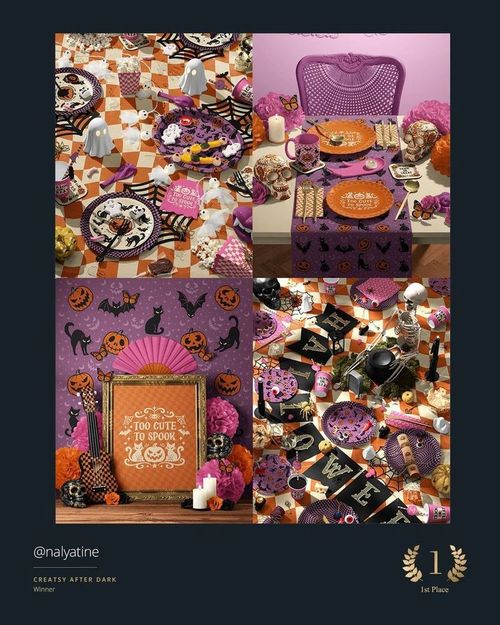
1st Place: @nalyatine, Tricks, Treats & Retro Beats. Retro cats, pumpkins, checkerboards and Too Cute to Spook across the original entry and final scenes. Mockups by Creatsy.
2nd Place: @noemimarozsan_designs
@noemimarozsan_designs built an atmospheric collection in black and beige, with ravens, skulls, roses, moths, chandeliers and spiderwebs woven into a toile-inspired pattern.
The intention was clear from the first-round caption:
“My goal was to evoke the atmosphere of a haunted Victorian home: a little eerie, yet elegant.”
The final scenes give that idea several expressions. The detailed repeat covers table linen and walls. Individual ravens and skulls become plate designs. A large moth stands alone in an ornate frame, allowing the linework and silhouette to carry the composition.
That shift between a rich repeat and an isolated illustration gives the collection variety while keeping its mood consistent. Even the spider-decorated mug and the dark web-patterned wall feel part of the same imagined interior.
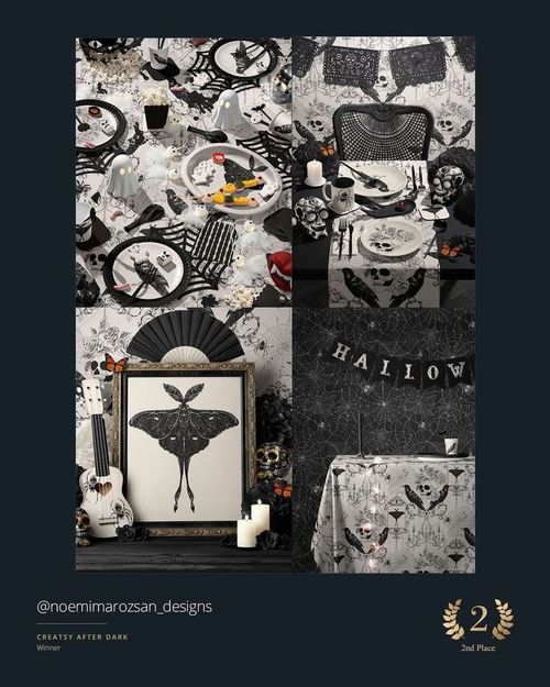
2nd Place: @noemimarozsan_designs. A gothic, toile-inspired collection of ravens, roses, skulls and moths in black and beige. Mockups by Creatsy.
3rd Place: @daintydora
@daintydora's collection is immediately recognisable through its mouths and fangs. Peach and lavender sit alongside black and white, with sharp bursts of neon pink and lime.
The main motif appears as a repeat on the tablecloth and wall, as a group of illustrations in the framed print, and as a focal design on the plates. A second black-and-white pattern and bold stripes give the presentation another rhythm.
The colour choices also tie the mockup’s existing frame, paper decorations, cutlery and candle to the printed designs. The result has the energy of a Halloween party with its own unmistakable visual identity.
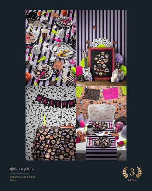
3rd Place: @daintydora. Expressive mouths and fangs meet bold stripes, monochrome patterns and neon accents. Mockups by Creatsy.
People’s Choice: @mvalladaresdesign
“Playful and sweet, with a touch of sophistication.”
That is how @mvalladaresdesign introduced the collection that received the People’s Choice award.
Its patchwork brings together cats, pumpkins, crows, stars and geometric shapes in orange, pink, brown, cream and black. The denser design has room to unfold across a wall, tablecloth or runner, while small white hearts on black provide a simpler companion pattern.
One orange cat becomes the subject of the framed print. On the table, the patterned runner sits alongside heart-covered plates, a pink crow-patterned mug and checked napkins. Each object has its own role, and the collection stays recognisable as the proportions change.
The audience’s choice adds another distinct visual approach to the winners’ line-up: graphic, warm and full of character.
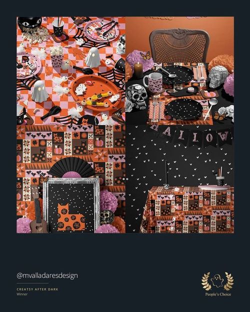
People’s Choice: @mvalladaresdesign. A geometric Halloween patchwork, tiny hearts and one very proud cat in a frame. Mockups by Creatsy.
Six More Finalists, Six Distinct Directions
The full finalist selection adds even more range to the story. These six collections each developed a clear relationship between illustration, pattern and setting.
Moonlight and Illustrated Stories
@miadaniela.patterns returned to The Midnight Society, a collection of black cats, watchful ravens, ivy, moths and celestial motifs in muted greens, cream and golden ochre.
“Three scenes, tied together by ivy, moonlight and a little midnight mystery. I loved exploring a quieter, more elegant side of Halloween.”
The framed cat and raven illustration gives the collection a central scene. Around the dining table, more delicate moth-and-ivy plates and a plain green runner let individual elements come forward.
@franceschang.designs used an enormous patchwork moon to frame a different story: children going trick-or-treating past a haunted house. Patterned sections build the moon, while black silhouettes make the scene easy to read. Across the final scenes, that illustration moves from a framed print to plates and a large wall graphic. Moon phases, stripes and little houses extend the story into coordinating designs.
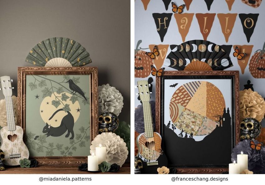
The Midnight Society by @miadaniela.patterns. Mockup by Creatsy. / A patchwork moon and a trick-or-treating story by @franceschang.designs. Mockup by Creatsy.
Pastels with Different Personalities
@roxannestewart.art brought a soft autumn palette to the final scenes: peach, pink, lavender, pale green and cream. Simple pumpkin outlines, scattered stars and gentle stripes connect the party table with the tablecloth scene. Her framed illustration introduces a particularly cosy character, a ghost tucked under a blanket with books, a drink and a teddy bear.
@artybeestudio took pastel goth into a darker setting:
“I wanted to keep the pastel goth but add more gothic chic to it to really feel alive.”
Lavender stripes, a pink horned creature, potion bottles and “Bad Vibes Slayer” lettering link the pieces. Dark backgrounds and frames give those pale colours a dramatic setting, while yellow accents keep the table lively.
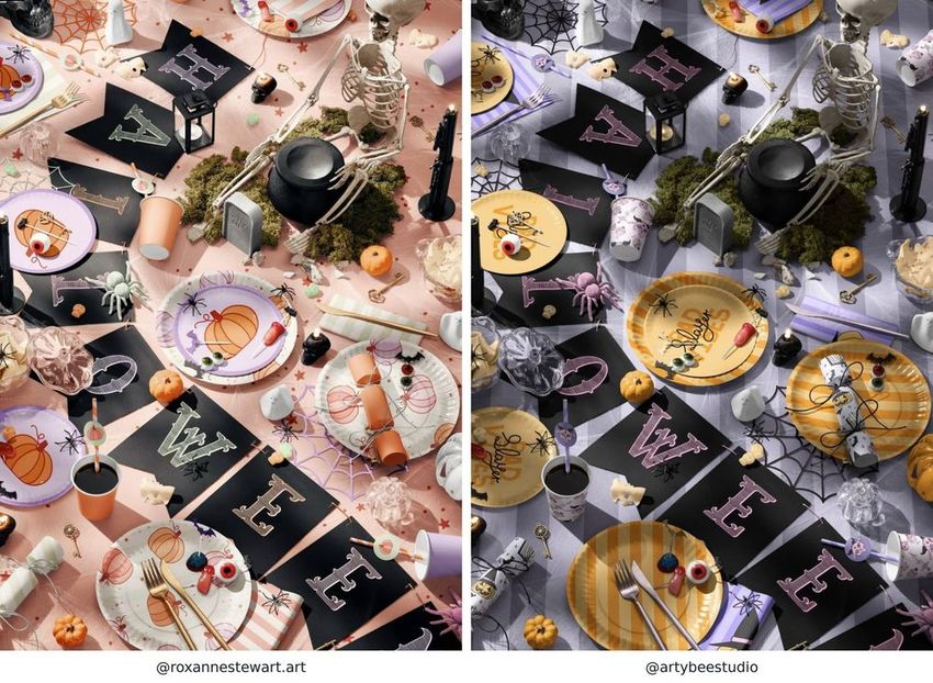
Pastel pumpkins and soft autumn colours by @roxannestewart.art. Mockup by Creatsy. / Pastel goth with a darker setting by @artybeestudio. Mockup by Creatsy.
Colourful Celebrations and Graphic Ghosts
@_chloecreative described the final work as a Day of the Dead party campaign, using colour to express “celebration, joy and love for those being remembered”. Lavender, pink and olive run through a skull checkerboard, pumpkin patterns and expressive character illustrations. The eye at the centre of a flower gives the plates a memorable focal point; the same palette connects the table setting with a framed hand-and-eye illustration and the other party scenes.
@belac.reative paired white ghosts with pink, teal, mint, cream and orange checks. The scale changes are especially clear: small ghosts cover plates, larger ghosts fill the tablecloth, and the checked pattern expands across a wall. A framed “NOPE” print adds a brief, characterful statement to the collection.
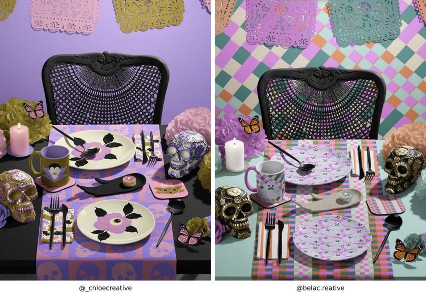
Day of the Dead-inspired illustrations and patterns by @_chloecreative, presented in a Creatsy table-setting mockup. / Ghosts and colourful checks by @belac.reative. Mockup by Creatsy.
Patterns on the Smallest Surfaces
One of the best observations came from @tabithascraft:
“There are even patterns on some of the straws!”
The table combined a new bat-and-bow pattern, selected designs from Haunted Harvest, and coordinating grid and zebra patterns. The small surfaces helped connect the larger ones.
That attention appeared throughout the challenge in the artwork applied to the mockups’ smaller surfaces. A checked napkin could pick up the colours of a plate. A cup could introduce one character from a larger repeat. Patterns on coasters and straws could echo designs used elsewhere in the scene.
Seeing all those decisions together made the mockups useful for looking at a collection as a whole: where it needed detail, where a simpler surface helped, and which illustration deserved to be seen on its own.
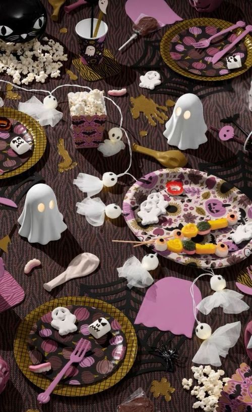
Down to the straws: @tabithascraft combines bats and bows, selected Haunted Harvest designs, and coordinating grid and zebra patterns. Mockup by Creatsy.
Imagining What Comes Next
For several participants, seeing the finished scene made a future product easier to picture.
Roxanne put that hope into words:
“I’ve been working on a Pastel Fall/Halloween collection and it would be so fun to see it come to life on party supplies or home decor!”
Other captions spoke about licensing, developing a portfolio, or returning to artwork that had been waiting for the right opportunity. The mockups gave those ideas a visible form: a plate someone might choose, a table they might set, a print they might hang.
Congratulations to @nalyatine, @noemimarozsan_designs and @daintydora, and to People’s Choice winner @mvalladaresdesign. Thank you to all ten finalists and to everyone who entered, shared their work, commented and supported another designer.
We hope you will spend some time with the artists’ profiles and look more closely at the collections behind these scenes. There is plenty to discover beyond a single image.
To explore your own seasonal collection, take a look at the Halloween Mockup Set. Its six scenes include party tables, table linens, wall surfaces and a framed-art setting, giving you several ways to present a connected collection.
Follow @creatsyofficial for more work from the community and future creative challenges.