App Launch Mockup Guide: How to Present Mobile UI on iPhone Screens


An iPhone mockup is how an app gets its product photo. The App Store page, the landing page and the launch post on Instagram all need the interface on a real phone, in real light, and they need it before the build has cleared App Review. This guide covers which images a launch needs, how to export screens so they fit the frame, and when a hand or a second device is worth the legibility it costs.
Apple announces new iPhones every September (this year on September 9), and every September designers with a Q4 launch ask the same question: do the mockups need redoing for the new phone? Almost never. Every iPhone with Face ID has roughly the same screen proportions, about 19.5:9, so one screenshot fits every frame from the iPhone 11 Pro to the iPhone 17 with a crop of under half a percent. You can check the math yourself against Apple's screenshot specifications.
The short version: export every screen as a flat rectangle at the phone's native resolution, with a 9:41 status bar and real content instead of placeholder text, and let the mockup's mask take care of the rounded corners and the Dynamic Island. Then build six images: a hero, a three-screen flow, a feature close-up, a dark-mode variant, one lifestyle scene, and the App Store set at 1320 × 2868 px. Photographed scenes go on the landing page and social. Flat, front-on frames go on the App Store.
What is an app mockup?
An app mockup is an image of an interface placed on a realistic device, so the design gets judged the way people will meet it: on a phone, at arm's length, behind glass. In practice it's a layered PSD with a smart object where the screen is. You double-click the smart object, paste your screen export, save, and the file wraps it in the phone's glass, reflections, shadows and viewing angle. The whole edit takes a minute in Photoshop or Photopea.
Four different things get called "mockup", and they do different jobs.
➙ A Figma frame is the design itself: flat, front-on, at 1x or 2x. It shows what the app does, and nothing about what it's like to hold.
➙ A device bezel is a flat frame around a flat screenshot. Apple publishes its own product bezels in Apple Design Resources, correct to the pixel, and they're the right choice for App Store screenshots and documentation.
➙ An AI-generated render puts a phone in a scene in seconds, but it can't keep your actual interface pixel-accurate, and the screen is the one part that has to be yours. Our test of AI mockup generators shows where they break.
➙ A photographed device mockup is a real phone shot in a real scene, with the screen swapped for a smart object. Angle, light, a hand, a bench, a concrete wall. This is the one that sells an app on a landing page, in a pitch deck and on Instagram, because it shows the product in someone's life.
This guide is about the last kind. The App Store set gets its own section, because it has its own rules.
Which six images does an app launch need?
Six images cover a launch: a hero, a flow, a feature close-up, a dark-mode variant, a lifestyle scene and the App Store set. With those six you can fill a product page, a press kit, a Product Hunt gallery and a month of social posts without rendering anything new. Most launches ship two, an angled hero and a row of screenshots, and then need something for Instagram a few days before release.
Image | What it shows | Where it goes |
|---|---|---|
Hero | One screen on one angled phone, plenty of empty space around it | Landing page header, press kit, Product Hunt |
Flow | Three or four screens in sequence, same angle, same light | Onboarding explainer, feature pages, pitch deck |
Feature close-up | One phone straight-on, cropped tight to the interaction | Feature sections, changelog, social posts |
Dark-mode variant | The hero screen again, in dark mode, same scene | Theme sections, social carousels |
Lifestyle scene | The phone in a hand or in an environment | Ads, stories, the "about" page |
App Store set | Up to ten flat, front-on screenshots at 1320 × 2868 px | App Store product page |
All six come out of the same two or three PSDs, so a multi-scene set beats a single file here. The iPhone 12 Pro Display Mockup Set holds 24 scenes at 6000 × 4000 px, flat, angled, stacked and paired, so the hero, the flow and the close-up share one light and one phone finish.
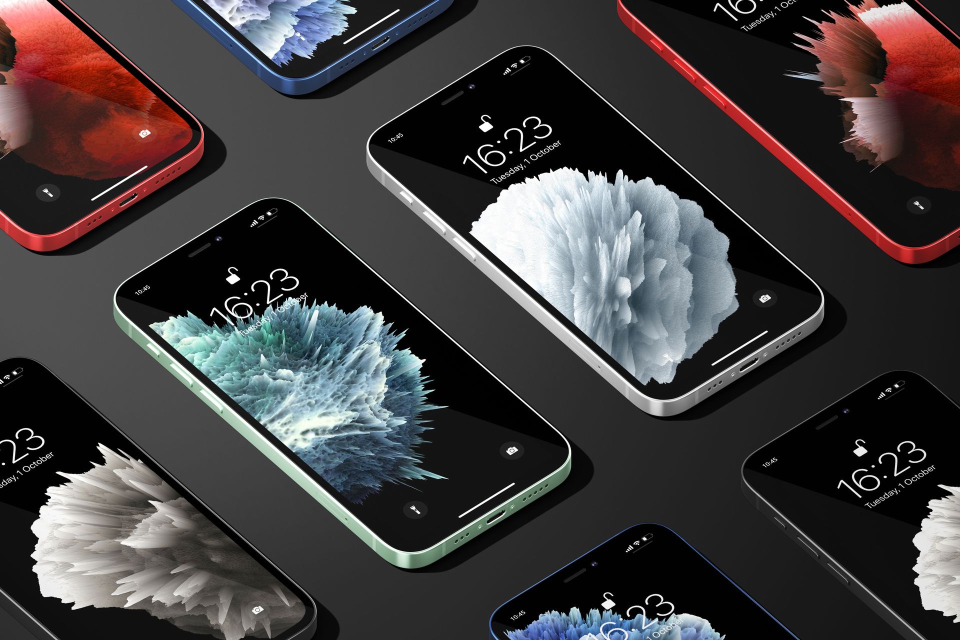
The full range of phone and tablet scenes is in Device Screen Mockups.
How do I export app screens so they fit an iPhone mockup?
Export each screen as a flat rectangle at the phone's native pixel size, with no rounded corners and no device frame baked in, and let the mockup's mask cut the corners and the Dynamic Island (the pill-shaped camera cutout at the top of current iPhone screens). Every iPhone with Face ID uses a screen close to 19.5:9, so a 1206 × 2622 px export made for the iPhone 17 fits an iPhone 12 Pro frame, and a 1170 × 2532 px export fits an iPhone 17 frame. The crop is too small to see.
Display | Devices | Screenshot size Apple accepts (portrait) |
|---|---|---|
6.9" | iPhone Air, 17 Pro Max, 16 Pro Max, 16 Plus, 15 Pro Max | 1320 × 2868 px |
6.3" | iPhone 17, 17 Pro, 16, 16 Pro, 15 Pro | 1206 × 2622 or 1179 × 2556 px |
6.1" | iPhone 17e, 16e, 14, 13, 12 Pro, 12 | 1170 × 2532 px |
The numbers come from Apple's own screenshot specifications in App Store Connect, current as of September 2026. Check that page again after the September 9 keynote, because any new size shows up there first. With the size sorted, five more things decide whether a screen looks pasted or photographed.
➙ Set the status bar to 9:41, full signal, full battery, no notifications. Apple's own product images show 9:41, and anything else reads as a screenshot someone grabbed in a hurry.
➙ Fill the screen with plausible content: names, numbers, a date that makes sense. Lorem ipsum tells the viewer the app isn't finished. Use the data your best user would see on their best day, and keep it consistent across all six images so they read as one person's account.
➙ Keep the corners square. If you export rounded corners from Figma, the mask adds its own radius on top and you get a thin dark halo in every corner.
➙ Export dark mode as its own screen and drop it into the same scene. A curves layer over a light UI isn't dark mode; it just darkens the light theme, and the text and accent colors come out muddy.
➙ Check the scale before you paste. Open the smart object, check Image > Image Size, and scale the export to that width with Free Transform. Photoshop has scaled proportionally by default since CC 2019, so don't hold Shift, it switches proportional scaling off. An export smaller than that canvas gets upscaled and goes soft, so export at the canvas size or larger.
And keep the glass. In our device files the shadows and highlights sit on their own layers, so a reflection that fights a dark UI can be pulled back to 40 percent instead of deleted. A phone with no highlight on the glass is the fastest way to make a mockup look pasted.
Single phone or multi-device scene?
Use a single phone for anything that has to be read at a glance, and a multi-device scene for anything that has to show a sequence or a system. One angled phone is the hero, the close-up and the ad. Three phones are the flow. A phone next to an iPad is the shot for a universal app. Five phones in a hero is the classic mistake: at landing-page size every screen becomes a thumbnail, and the visitor reads none of them.
The free iPhone 12 Pro Trio on Pedestals mockup exists for exactly this. Three phones on studio pedestals in one 6000 × 4000 px PSD, each display with its own smart object, and the background and pedestal colors on editable layers so the scene can match a brand palette. It's free for personal and commercial use under Creatsy's freebie license, and it's the right file to test a flow before you spend anything.
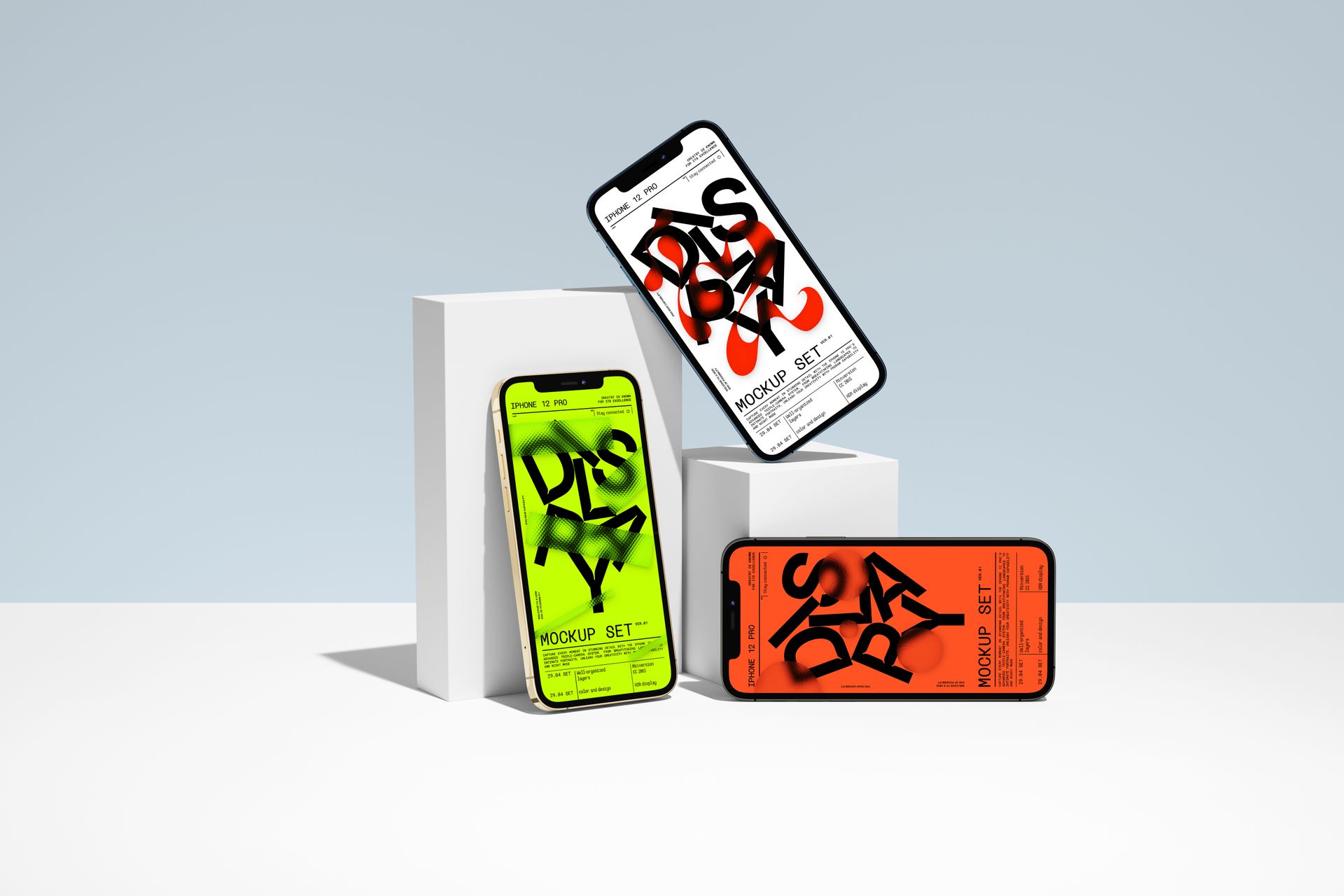
For a universal app, add the tablet. The iPad Pro Mockup Set has 12 studio scenes that match the iPhone sets, and iPad Pro with Flowers and iPad Pro on Sofa are the lifestyle counterparts.
When does an in-hand mockup beat a studio render?
Use an in-hand mockup when the image has to say "people use this", and a studio render when it has to say "look at this interface". A hand adds scale and a person, so in-hand scenes work in ads and stories. It also costs legibility, because a thumb and a tilt both take pixels away from the UI. So the hero and the close-up come from the studio, and the lifestyle shot, the story and the ad get the hand.
The iPhone in Hand Against Ribbed Concrete Wall Mockup is our newest scene in the category and a good example of what a hand is for. One vertical PSD at 4000 × 6000 px and 300 DPI: a phone held naturally in one hand, a ribbed concrete wall behind it, and the hand's own shadow falling across the ribbing. We photographed the scene rather than compositing it, so the shadow on the wall is the real one from the shoot. Composited renders usually get that shadow wrong. The phone body has the current Dynamic Island cutout, so a screen exported for a recent iPhone lands exactly where the mask expects it.
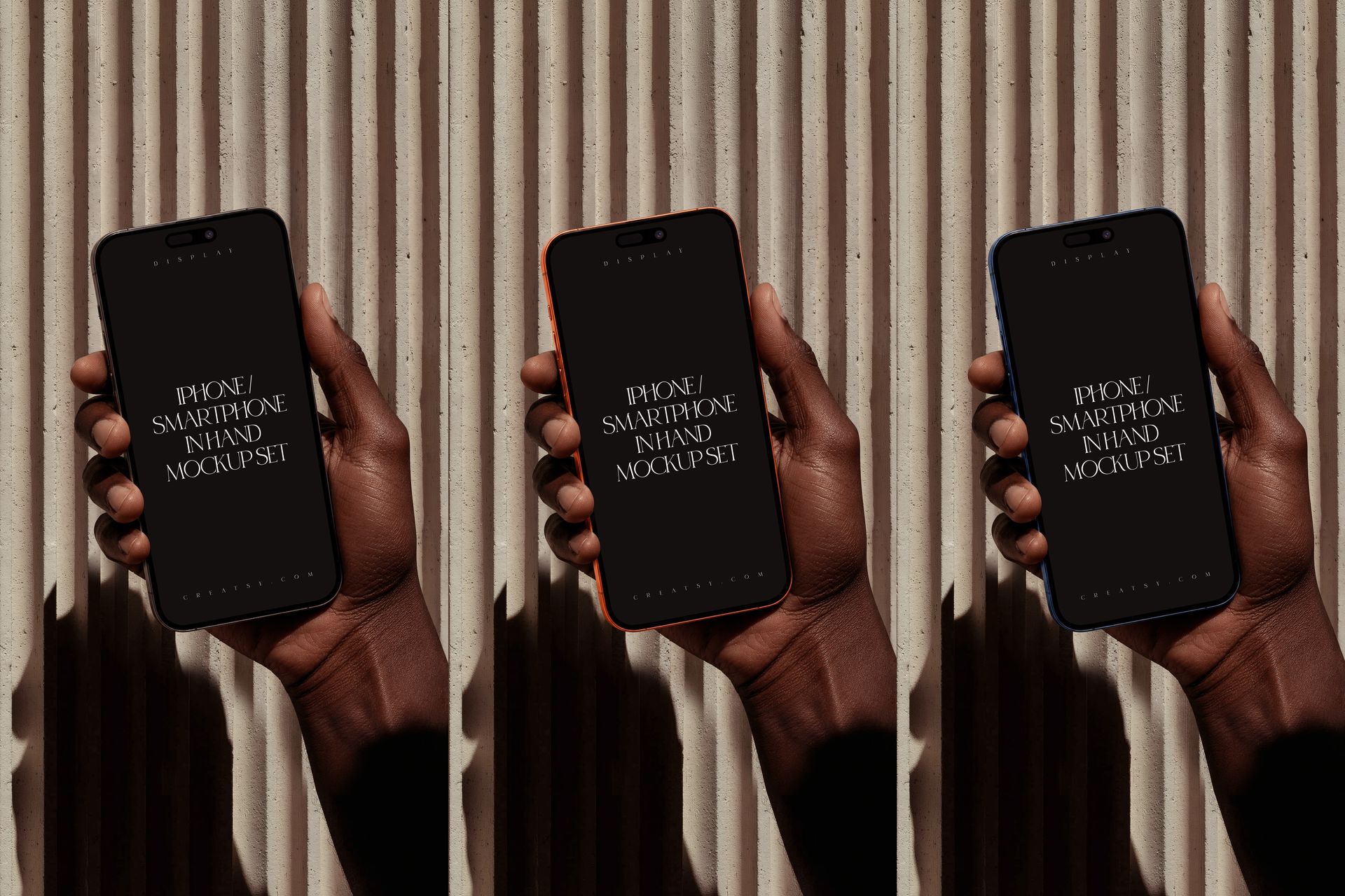
Two rules for hand scenes. Keep the interaction plausible: the screen state should match what the thumb is about to do, and a settings page under a thumb that's clearly mid-swipe looks wrong. And keep the copy off the phone. A slogan on a tilted screen is unreadable on mobile, where most of your audience will see it.
How do you present an onboarding flow on iPhone mockups?
Show three or four screens, in reading order, at the same angle, with one line of copy above each. An onboarding flow is a story with a beginning (permission or sign-up), a middle (the first real action) and a payoff (the screen that proves the app works). Pick the screen that represents each beat and skip the rest. A flow with nine screens is a sitemap.
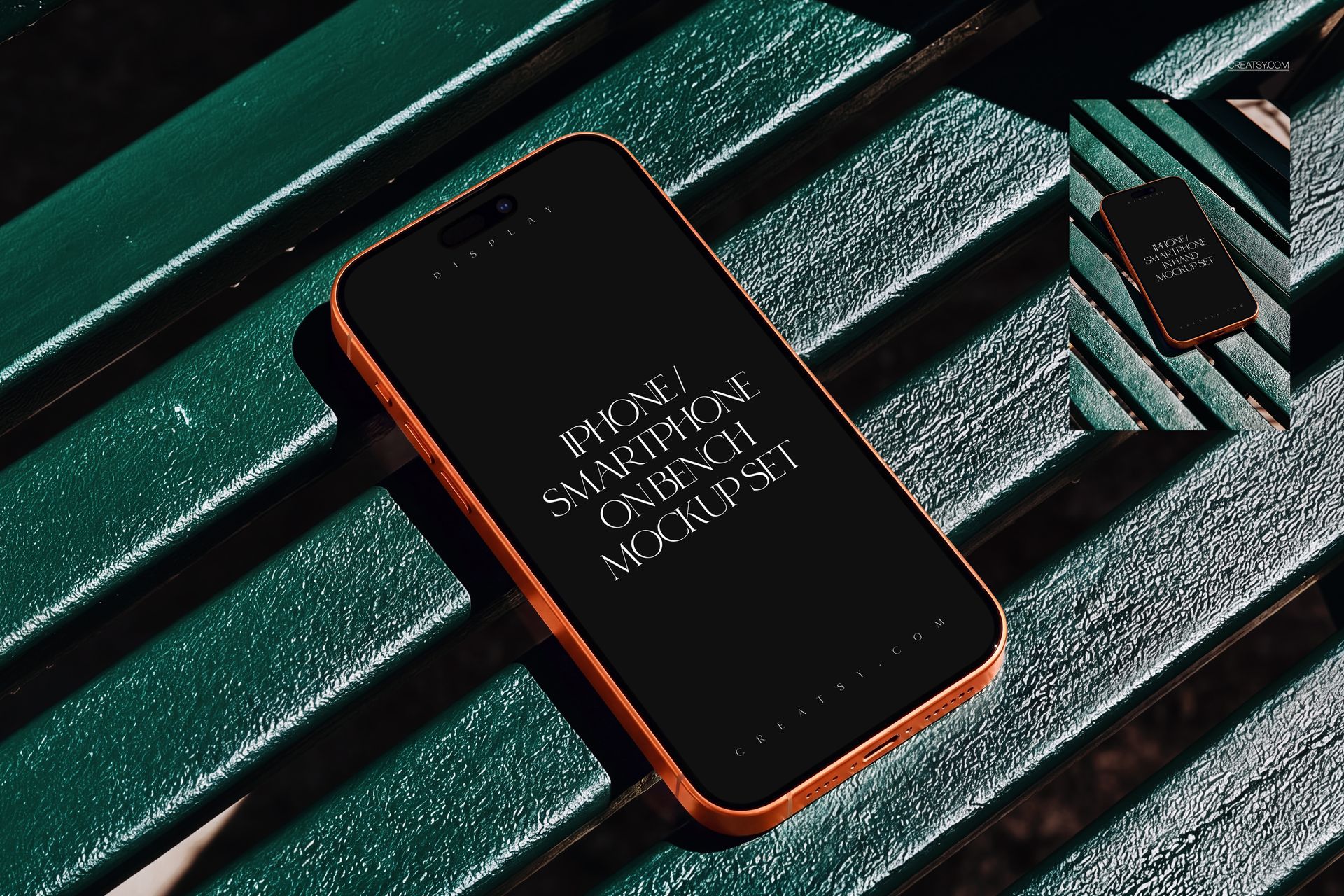
Keep the screens consistent: same phone finish, same angle, same light, same shadow. That's easiest when the whole flow comes from one multi-scene set, because three separate downloads means three different lights. The iPhone Smartphone on Rocks Mockup Set gives you 16 scenes on the same warm rocks in portrait and landscape, three body colors (orange, silver, blue) and filter effects you can fade or remove, so a four-screen flow keeps one atmosphere from the landing page to its social cut-downs. Its sister set, the iPhone Smartphone on Park Bench Mockup Set, covers both orientations a campaign needs: a landscape scene at 6000 × 4002 px for the website and a portrait one at 4002 × 6000 px for stories.
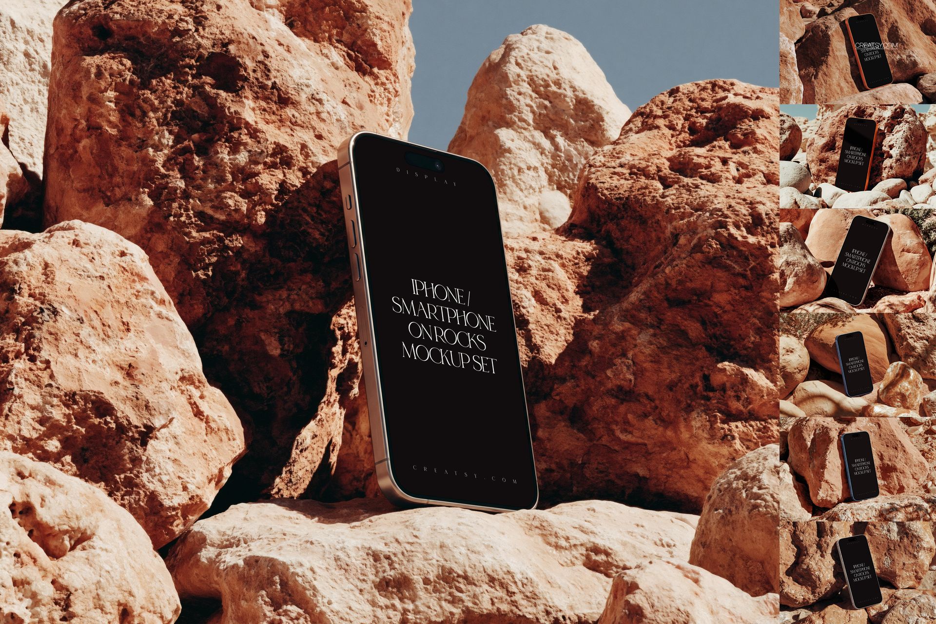
Put the step numbers in the copy above the phones ("1. Pick a plan. 2. Connect your bank. 3. See your first report.") and leave the screens alone. Skip the arrows between phones, too; they date a design.
App Store screenshots vs landing-page heroes: what changes?
The App Store wants flat, front-on, exact-size screenshots. The landing page wants a photographed, angled hero. Both sets come from the same screen exports, and they shouldn't be swapped. The App Store rules, from Apple's own documentation as of September 2026:
➙ One to ten screenshots per device size, in JPG or PNG, with no alpha channel or transparency.
➙ The set Apple asks for first is the 6.9" display set (1320 × 2868 px portrait for the current Pro Max); if you skip the smaller sizes, Apple scales this set down for them.
➙ App Review Guideline 2.3.3: screenshots must show the app in use. Title art, a login page or a splash screen alone won't pass. Text and image overlays are allowed.
➙ Product page optimization lets you test up to three alternative sets of screenshots against your original and keep the winner, so you can treat the first screenshot as something to test and change it when the numbers say so.
Apple's product bezels are the right frame for that set: flat, exact, and matching the phone the screenshots will be viewed on. A photographed, angled scene in slot one looks like an ad and spends half its pixels on a wall.
The landing page is the opposite brief. Nothing has to be pixel-exact, everything has to be understood at a glance, and the image will be seen at 400 px wide on a phone as often as at 1400 px on a desktop. Export the hero at twice its display width (a 1600 px slot gets a 3200 px WebP), keep the phone large in the frame, and put the headline beside the phone. Text on the screen itself is unreadable at 400 px.
What are the most common UI mockup mistakes?
Most weak app mockups fail on the same seven things, and none of them takes long to fix.
➙ A stretched screen, usually a 16:9 Android capture forced into a 19.5:9 iPhone frame. Check the ratio before you paste and fix it with a correct export, because Free Transform won't save it.
➙ Double corners, when rounded corners exported from Figma meet the mask's own radius.
➙ Placeholder content: lorem ipsum, "User Name", a progress bar at 0 percent. Fill it as if an investor were about to see it.
➙ Mismatched status bars, 9:41 on one phone and 14:07 with a low battery on the next.
➙ Dead glass, meaning reflections deleted to uncover the UI. They're what makes the phone read as glass, so lower the opacity instead.
➙ Too many phones. Five devices in a hero, nine screens in a flow. Cut to one, three or four.
➙ A weak export, typically a hero saved as a 1200 px JPG and then stretched by the website. Export from the 300 DPI file at twice the display width, as WebP.
If a smart object refuses to update, or the design goes in blurry, the fix is almost always in Smart Objects in PSD Mockups: The Most Common Errors and Quick Fixes.
Recommended Creatsy mockups for an app launch
Mockup | What you get | Best for |
|---|---|---|
1 PSD, 4000 × 6000 px, hand-held, new in August 2026 | The lifestyle hero, ads, stories | |
24 PSD scenes, 6000 × 4000 px, flat, angled, stacked, paired | Hero, close-up, flow and dark-mode variant from one download | |
24 PSD scenes with the iPhone 12 body in several colors (the cover of this post is one of them) | Colorful heroes and social carousels | |
16 PSD scenes, portrait and landscape, three body colors | Flows and campaigns with one atmosphere | |
2 PSDs, one landscape and one portrait | Website hero plus stories from the same scene | |
1 PSD, three phones, free for commercial use | Testing a flow before buying anything | |
12 PSD scenes | The tablet half of a universal app |
All of them are layered PSDs with smart objects and clearly named layer groups. The newer scenes open in Photoshop CC 2020 or later and in Photopea; the rest of the category is in Device Screen Mockups.
Who is this for?
Four groups build app presentations on a deadline. Indie developers shipping a first app, who need a landing page and a screenshot set in the same week. Product designers writing a case study, where every screen has to sit in the same scene so the work gets judged on its own terms. SaaS marketing teams who need release visuals for every update without waiting on a designer. And agencies pitching an app before a line of code exists, where a phone in a hand is the difference between an idea and a product.
FAQ
What resolution should app screens be for an iPhone mockup?
Export at the device's native size from Apple's screenshot specifications: 1206 × 2622 px for the iPhone 17, 1170 × 2532 px for the iPhone 12, 13 and 14 frames, 1320 × 2868 px for the Pro Max. Every iPhone with Face ID uses a screen near 19.5:9, so any of those fits any frame with a crop under half a percent. Larger is fine. Smaller goes soft.
Can I use a photographed iPhone mockup as an App Store screenshot?
You can, nothing in Apple's guidelines forbids it, but it wastes the slot. App Store screenshots are viewed at thumbnail size in search results, and a photographed, angled scene spends half of those pixels on a wall or a hand while the interface ends up tilted and small. A flat, front-on screenshot in one of Apple's own product bezels shows the app much larger in the same space. Keep the photographed scenes for the landing page, ads and social posts.
Which iPhone model should the mockup show?
Whichever fits the scene, because viewers look at the interface and rarely at the model year. The screen ratio has stayed near 19.5:9 since the iPhone X, so a 12 Pro frame and a 17 frame take the same export. If your audience will notice the Dynamic Island, pick one of the newer scenes such as the ribbed wall, park bench or rocks sets, which use a current body.
Do I need Photoshop to edit iPhone mockup PSDs?
No. Creatsy's online mockup editor runs on Photopea in the browser, opens layered PSDs and edits the smart object the same way: double-click, paste, save, export. Photoshop CC 2020 or later is faster on the sets that run past a gigabyte, but it isn't required.
How many screens should an onboarding mockup show?
Three, four at most: the entry point, the first meaningful action and the payoff. Show them at the same angle and in reading order, with a single line of copy above each. A longer sequence belongs in an App Store preview video or a scrolling feature section; one image can't hold it.
That's the whole system: six images, one scene set, screens exported flat at native size.
Start with the free trio to test the flow, then build the rest of the set from one multi-scene download in Device Screen Mockups. And if you're new to layered files, What is a mockup? covers the basics.