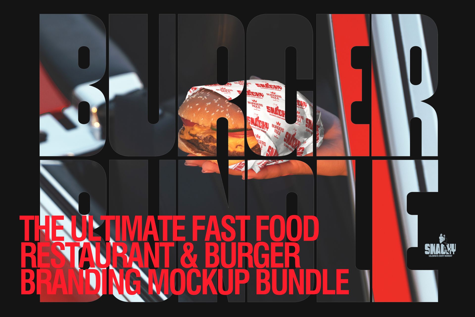
Burger Brand Refresh in 2026: Trends, Examples, and Ready-to-Use Mockups


In 2026, most burger brands don’t lose because the burgers are bad. They lose because they look like everyone else. On delivery apps, people scroll like they’re speed running dinner. On social, your packaging shows up for half a second in someone’s hand. In real life, it’s a bag, a cup,
a box, and a shadow. If your brand doesn’t snap into focus instantly, you’re not competing on taste. You’re competing on invisibility.
That’s why a refresh right now is rarely about redesigning the logo from scratch. It’s about building a system that’s loud on purpose: bold color, bold type, and a world that feels real. The strongest references have the same energy. One dominant color takes over the scene, black type doesn’t apologize, and the whole thing feels like a character, not a template. That’s the direction that wins attention.
What feels new in 2026 when you go bold
The strongest fast-food identities aren’t trying to look polished. They’re trying to look unmistakable. Instead of “minimal but tasteful,” the energy is more graphic and fearless, but still balanced with enough texture and real life lighting to keep it human.
You can usually spot the formula in one glance: a limited palette (often one hero color plus black), typography that behaves like the logo, and a simple mascot or icon that gives the brand a face. Add punchy photography, hard light, strong props and suddenly the brand feels like a place, not just a mark.
The moves that make bold burger branding work without turning into chaos
1) Pick a hero color and commit
Bold branding isn’t about using every color. It’s about committing to one color so hard it becomes a shortcut in people’s brains. Orange is classic for a reason: it’s warm, loud, and it makes food look good. But the same approach works with deep red, electric blue, acid green, or punchy yellow as long as the system stays tight.
A simple structure that keeps everything readable:
a calm base (white or warm neutral),
one hero color that carries the mood,
one dark text color that never breaks legibility.
Do this well and your packaging looks strong in thumbnails and still holds up under harsh, real world lighting.
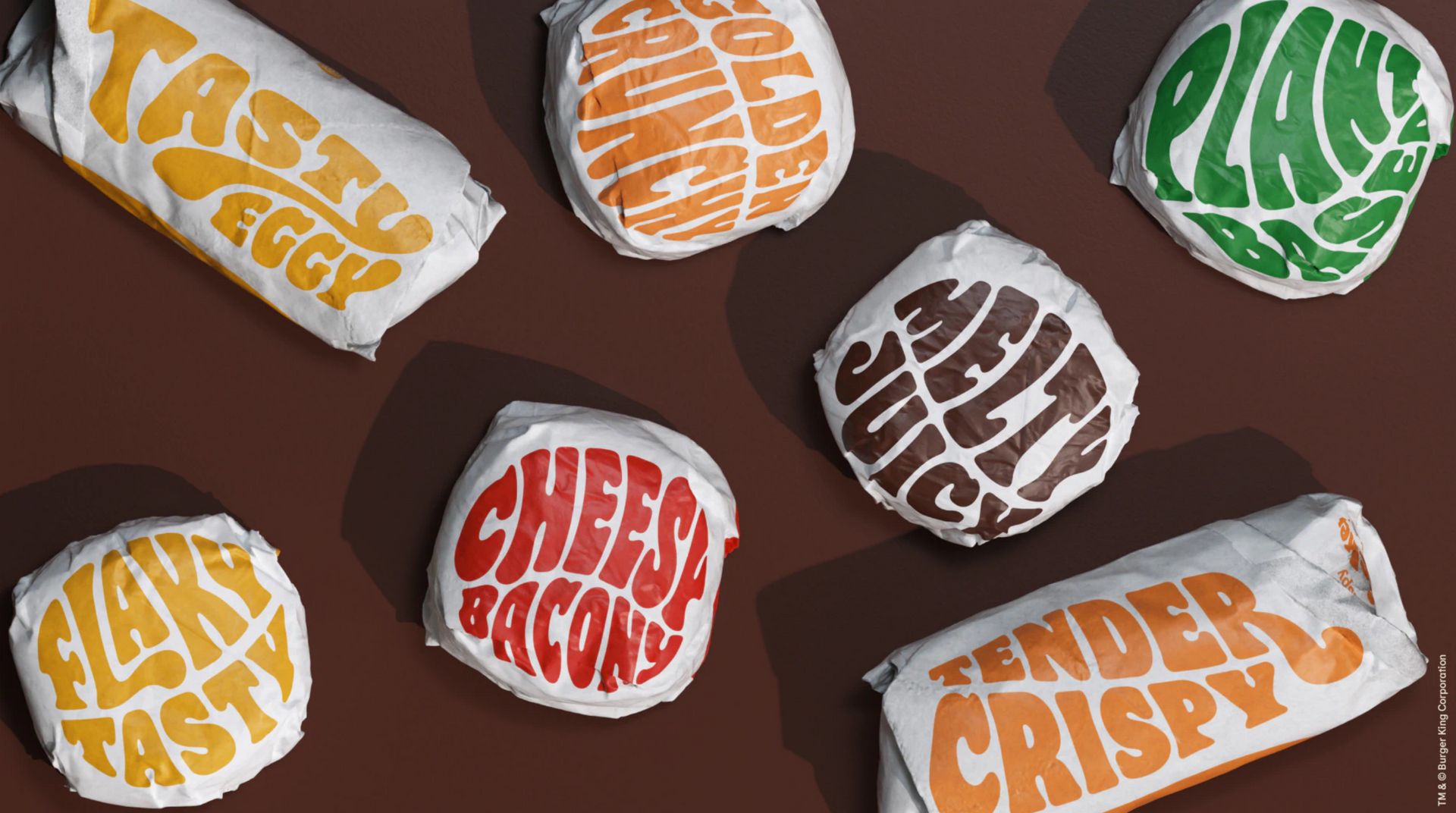
2) Let typography do the heavy lifting
In bold burger branding, type is the hero. Big letters often read faster than logos, especially on crumpled paper, imperfect printing, or a moving delivery bag. Heavy, condensed, blocky fonts work because they stay legible at a distance and still look confident when production isn’t perfect.
The key is hierarchy. Go loud with the headline layer (brand name, burger names, short punchlines), then go intentionally quiet for functional information (ingredients, allergens, addresses). That contrast is the difference between “graphic” and “messy.”
3) Add one mascot or icon that carries personality
A simple illustrated icon is the fastest way to make the brand feel like a character. It can be a face, an animal, a burger doodle, a flame, anything, as long as it’s simple enough to repeat everywhere.
On stickers, wraps, stamps, tray liners, social posts, and merch, that icon becomes your recognition stamp. It also makes drops and collabs easier: swap an expression, add a prop, change a pose and you’ve got a new moment without rebuilding the brand.
4) Keep it tactile: print texture beats sterile perfection
Perfect, smooth branding can look generic right now. Texture is how you signal “real.” Light grain, halftone shading, slightly imperfect stamp edges, and paper fibers give packaging that printed, physical vibe.
The key is subtlety: enough to feel, not enough to muddy readability. If you need one image that sells this idea instantly, use a tight close-up where the paper and ink look touchable.
5) Use micro labels and spec-style details for modern energy
Tiny labels and technical style stamps look surprisingly fresh on burger packaging and they help organize a menu visually without adding more colors. Think spice meters, “SMASH / CHAR / DOUBLE” tags, drop numbers, weekend-only markers, or sourcing notes.
This works especially well on menus and posters, where micro typography can shine and make the brand feel like a complete system not just packaging graphics. Small details are what make a bold brand feel intentional instead of loud-for-no-reason.
6) Build a brand world, not just packaging
Bold systems get recognised faster when the brand lives in a scene. Props, lighting, and color environments do half the branding work. A chair, a tray, a bold background, a hard shadow and suddenly the packaging looks like it belongs to a world people want to step into.
That’s the mental shift this year: stop thinking “logo on box” and start thinking set design. Your brand should look good in a hand, on a table, in a car, under ugly fluorescent light, and in a quick phone photo. When it does, customers start doing your marketing for you.
Case studies: two bold systems that stay tight
Burger King (JKR, 2021) - typography + color that reads in a second
Burger King’s refresh is a good reminder that “bold” doesn’t have to mean messy. The system leans on a food led palette and typography strong enough to carry the brand when the logo is tiny. Packaging stays high contrast and fast to read across formats. That’s exactly what you need in delivery thumbnails and quick phone photos.
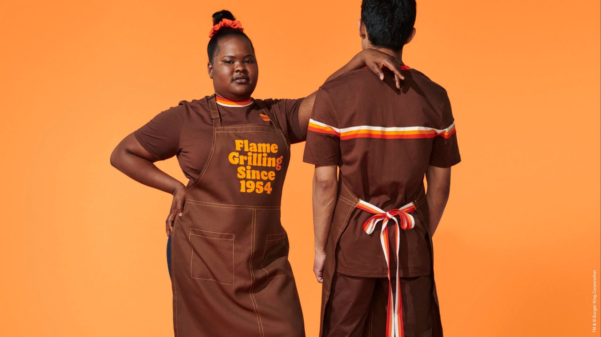
Key takeaways:
Hero palette that feels ingredient-led (not random loud)
Type doing the recognition work
Clear hierarchy that survives real-world print
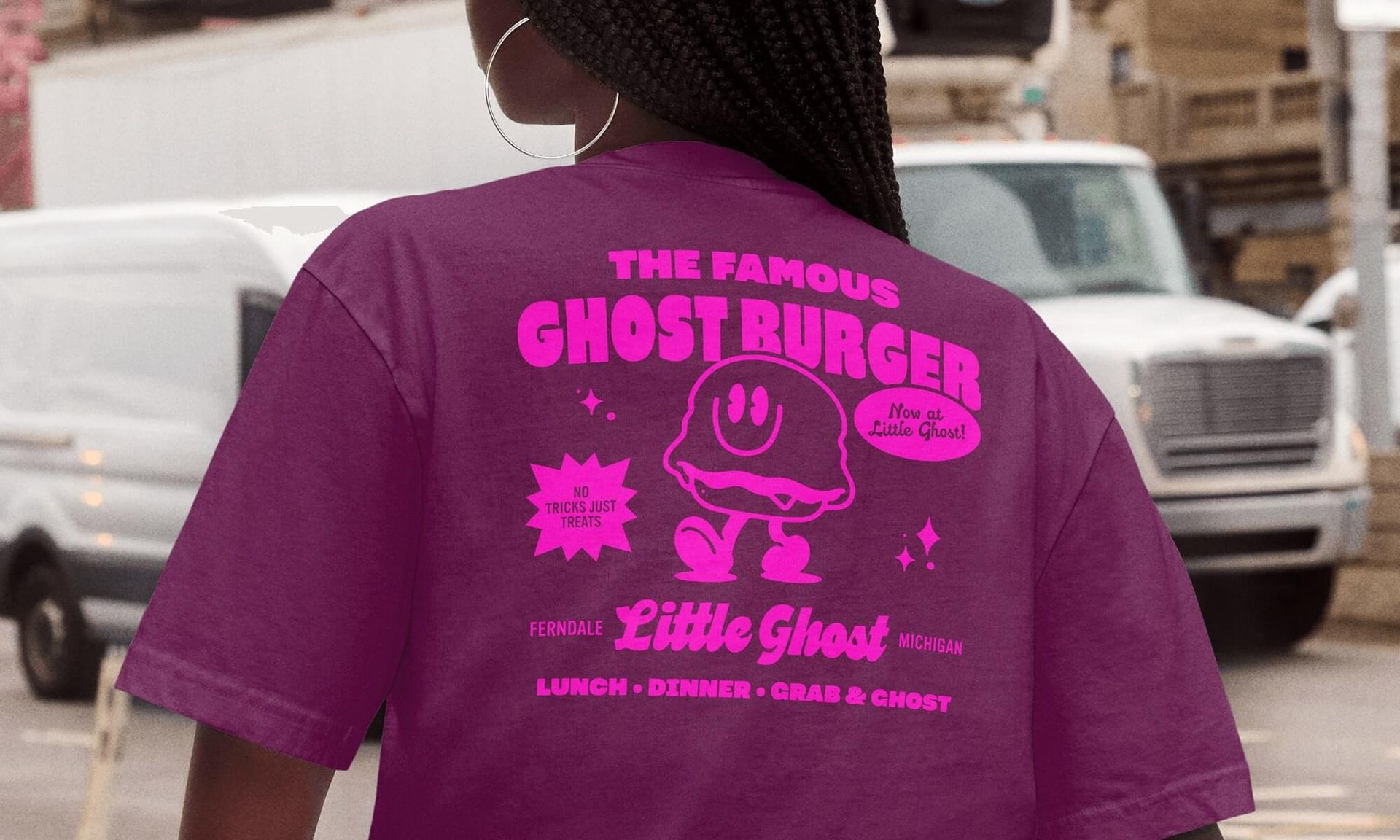
Little Ghost (Skidmore Studio, 2025) - mascot-led worldbuilding, built for repeat
Little Ghost shows the newer move: don’t just design packaging, build a scene. A distinctive “world color” sets the mood instantly, while a simple mascot becomes the memory hook across signage, menus, and packaging. Bold repetition does the heavy lifting, then micro details (small copy/sticker energy) add depth without adding chaos.
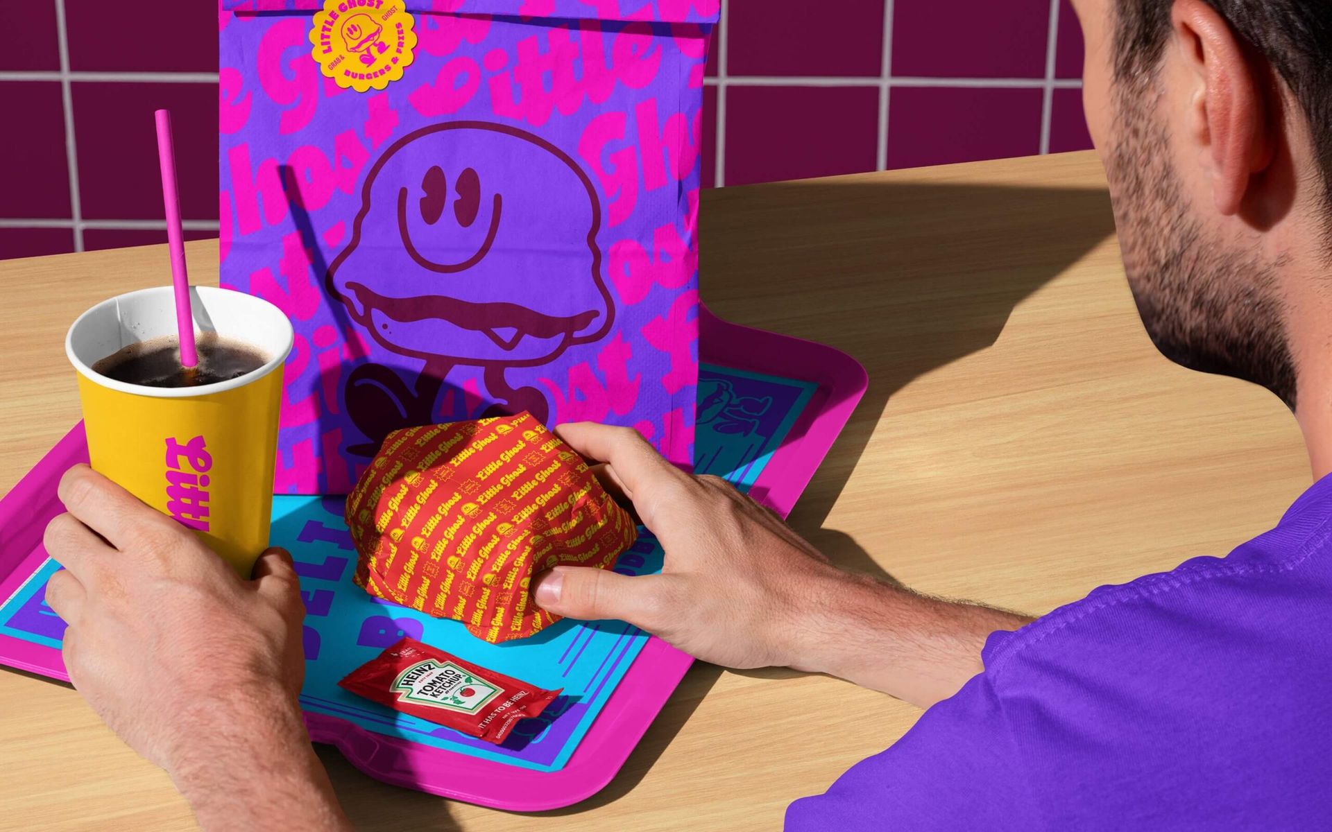
Key takeaways:
One world color that makes every photo feel consistent
A mascot that scales everywhere
Micro details that reward close-ups and sharing
How to use mockups so they prove the system
If you want people to do more than skim, treat mockups like evidence, not decoration. Start with one loud hero image at the top that sets the world instantly. After the hero-color section, show a multi-item set so the palette reads as a system. After typography and texture, use close-ups that prove readability and physical detail. Finish with one more lifestyle scene near your CTA, so people leave with the vibe in their head.
A simple structure that works:
Hero lifestyle image at the top
One “system shot” in the middle (bag + box + cup)
Two close-ups for type and texture
One menu or poster mockup for micro labels
One final lifestyle image next to your CTA
Single mockups to build your burger brand system
If you want to explore this direction without committing to a full set on day one, start with individual mockups and build the system step by step.


Want the full system? Start with a bundle
If you’re building a complete fast-food identity (packaging, menu, social visuals, delivery shots, and in-store presence) it’s often smarter (and more cost-effective) to start with a cohesive bundle. Instead of hunting for matching angles and lighting across random mockups, you get a unified visual world that’s ready to drop your design into.
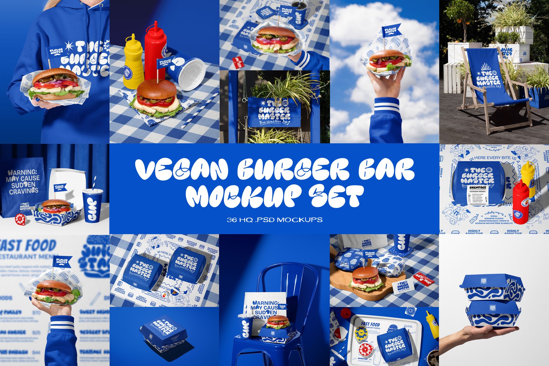
If you’re working on a plant-based concept, there’s also a Vegan Burger Bar Mockup Set: a focused identity set for modern vegan burger brands, clean, character-driven, and built for strong visual storytelling. No mixing and matching required, the system is already aligned.
One last note: this isn’t the only “right” look
A loud, high-contrast system is a great fit if you’re fighting for attention in delivery apps and social. But it’s not the only lane. If your brand is truly premium, minimalist might still be the right move, just make sure it’s distinct, not generic. Either way, the goal stays the same: be recognizable in a second.
Burger King (JKR, 2021):
- https://www.itsnicethat.com/news/burger-king-rebrand-jkr-graphic-design-070121
- https://www.creativereview.co.uk/burger-king-rebrand/
- https://www.fastcompany.com/90665634/burger-king-rebrand-innovation-by-design-2021
- https://www.dandad.org/work/d-ad-awards-archive/flame-licked-type-your-way
Little Ghost (Skidmore Studio, 2025):