How to Find Color Harmonies on a Color Wheel


When it comes to selecting paint colors, the color wheel is a great source of inspiration. This circular diagram maps the hues of the rainbow, divided into 12 basic colors: three primary, three secondary, and six tertiary. It makes it easy to visualize how different colors relate to one another, opening up hundreds of potential combinations.
The Color Wheel
Below are twelve segments of colors displayed in a color wheel in a way that represents their chromatic relationship to one another.

Primary Colors
The primary colors are red, yellow, and blue. These are called “primary” because no other color combination creates these colors.

Secondary Colors
Directly across from red is green. Green is the secondary or complementary color to red. Across from yellow is purple. Across from blue is orange. The secondary colors are created by combining two primary colors. Red and yellow combine to make orange. Yellow and blue combine to make green. Blue and red together make purple.

Tertiary Colors
This leaves six additional colors on the color wheel, one on each side of a secondary color. These colors are called “tertiary colors.” They are made by combining an equal amount of a primary color, such as red, with a secondary color, such as purple, adjacent to it on the color wheel. Together, the primary color red and secondary color purple make a reddish-purple.

Complementary Color Harmony
These twelve colors can be used in various combinations to create multiple color harmonies. A color relationship is said to be “complementary” when the two colors are direct across from one another on the color wheel. Purple and yellow have a complementary chromatic relationship.

Split Color Harmony
Another type of color relationship is called split color harmony. This is where instead of choosing the color directly across from one another, you choose the two colors that neighbor it. For example, the complementary color to blue is orange. Instead of choosing orange to show a split color relationship, we’ll select red-orange and yellow-orange to pair with blue.

Triadic Color Harmony
A triadic relationship on the color wheel might look similar to the split harmony. Still, it depicts a relationship where each color is set at an equal distance from the other color. For example, in this image below, we see that purple, a secondary color, is three colors away from orange, another secondary color, and three colors away from green, also a secondary color. This relationship can be made from any starting point on the color wheel as long as the distance from each color is the same in either direction.

Tetradic Color Harmony
The tetradic color relationship looks like a rectangle placed over the color wheel. This is achieved by finding a complementary relationship, such as blue and orange, and then choosing the two colors that neighbor it, so the blue-purple and the blue-green paired with the yellow and the orange.

Double Split Color Harmony
The double split complementary harmony makes a square shape over the color wheel. The difference between this and the tetradic is that each color is an equal distance from the others in the color harmony. As you can see below, two colors are in between each selection. Purple is the complement of yellow, and red-orange is the complement of blue-green.

Analogous Color Harmony
The last color harmony we’ll discuss using the color wheel is analogous color harmony. This is where you choose the colors adjacent to the principal or base color. In this example, yellow is our base color. We’ll pair it with yellow-orange and yellow-green to create analogous color harmony.

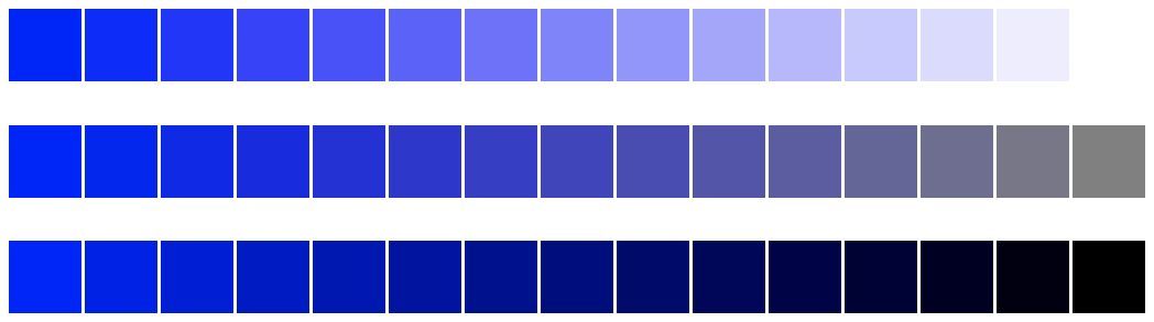
Monochromatic Color Harmony
The final color harmony utilizes only one hue and adds either white to create a tint, gray to make a tone, or black to make a shade. Here is a monochromatic color scheme using blue, white, gray, and black.
The Takeaway
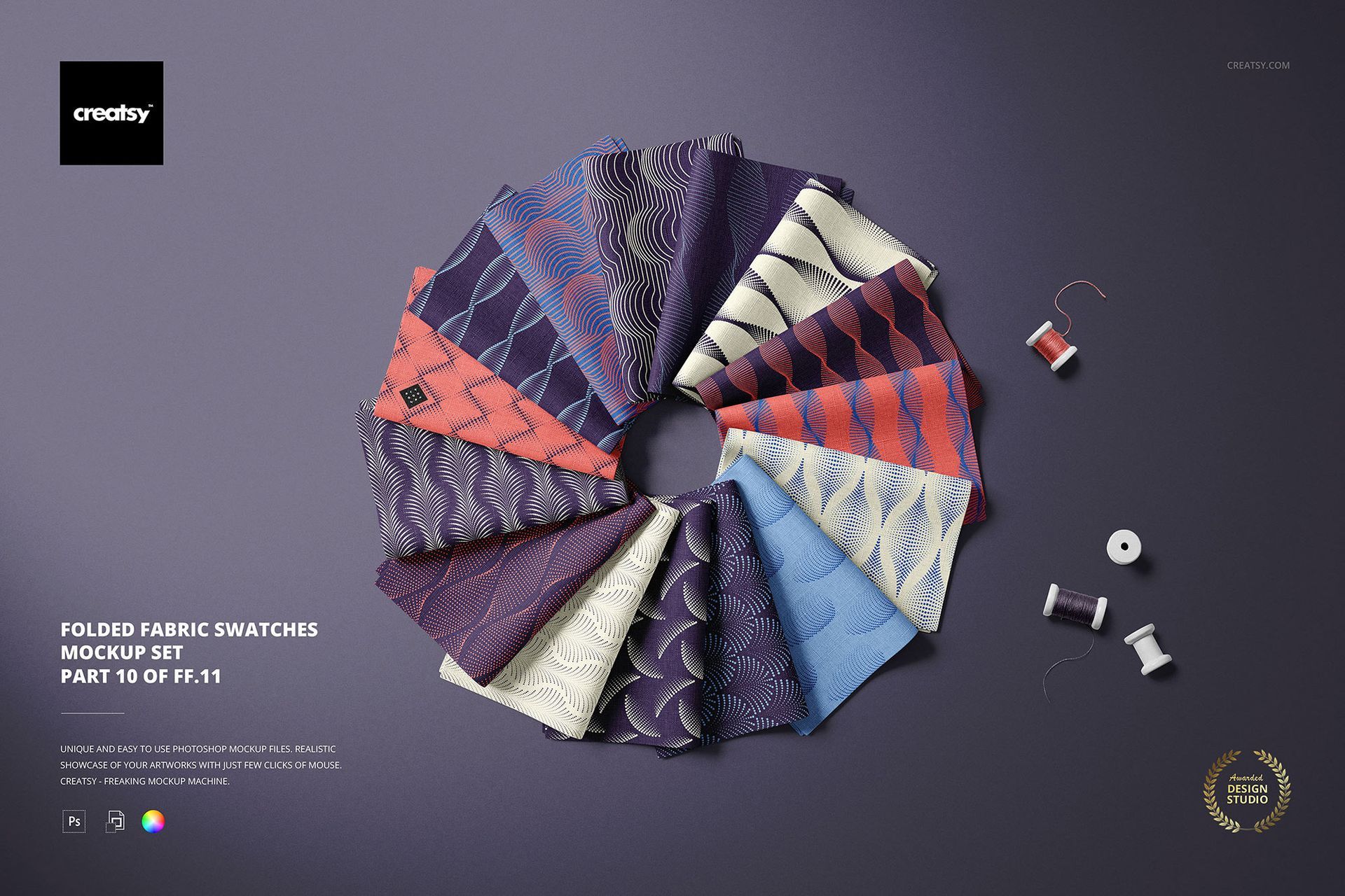
Using the color wheel to find color harmonies is a great way to create a striking color palette. Do you want to experiment with making some unique color combinations? Try it out by mocking up a fabric swatches Folded Fabric Swatches Mockup Set!