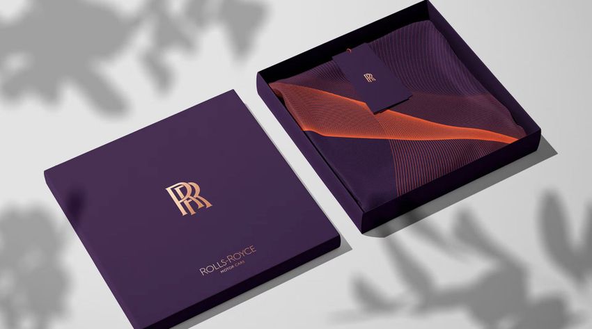
Creatsy Mockup in new Rolls Royce Identity

Discover the refreshed identity of Rolls-Royce, the epitome of luxury. Pentagram, the world’s largest independent design consultancy, has unveiled a modernized branding strategy to attract a younger and affluent audience.
The iconic phrase, "Take the best that exists and make it better," by co-founder Sir Henry Royce, inspired Rolls-Royce's evolutionary change. No longer just for the rich and famous above 60, the new brand image aims to appeal to a broader demographic of equally affluent consumers. To feature the revitalized identity of Rolls-Royce, Pentagram choosed Creatsy’s mockup for the silk and box. To purchase your own version of this mockup to design with your artwork, check out the Silk Silk Scarf Box Mockup Set.
Curious about the brand changes?

Rolls-Royce's Black Badge edition has addressed the desires of some clients for a more rebellious and unconventional luxury car. The brand's average client age has decreased to just 43, indicating a younger and more diverse audience. Rolls-Royce seeks to update its visual identity to reflect its evolution and contemporary future. The company is updating its brand identity to match the shifts in its portfolio, customer demographics, lifestyles, and the luxury world surrounding them. CEO Torsten Mu¨ller-Ötvös says, “There has never been a more important time for the visual language of the company to reflect our standing as the leading luxury brand in the world.”
Marina Willer, a partner at Pentagram, was appointed by Rolls-Royce to create a new brand identity that would capture the brand's presence and standing as a luxury house beyond being just the "Best Car in the World." The goal was to appeal to the new demographic of clients digitally and physically. Marina embarked on a deep exploration of the brand, its design ethos, products, designers, and its unique relationship with its clients. She noted that the brand has evolved into a leading light in the world of luxury, and this renewed identity needed to reflect this shift while respecting its loyal clients. Her fresh perspective, having no automotive background, allowed her to celebrate the luxuriousness of the brand and provide it with a visual language that could speak to its younger, diversified audiences.
The Rolls-Royce brand refresh commences with the iconic ‘Spirit of Ecstasy’, a symbol of luxury since 1911. The figurine embodies beauty, style, and perfection, remaining one of the world's most famous symbols. Pentagram has given her a more prominent role in the brand identity. The sculpture remains unchanged, but an iteration of the figurine has been illustrated. Leading illustrator Chris Mitchell was appointed to envisage the distilled form of the iconic statuette. When depicted in two-dimensional form, her direction has changed from left to right, boldly facing the future, reflecting the marque itself. Marina explains that "The use of the ‘Spirit of Ecstasy’ marks a shift in the resonance of the brand – from an automotive to a lifestyle context. She commands an aspirational quality in the luxury sphere and by placing her at the center of the visual language."
Rolls-Royce has unveiled a new identity that better reflects the marque's position as a leader in the world of luxury. Marina Willer, a partner at Pentagram, was tasked with creating a brand identity that would appeal to a broader demographic of clients and reflect Rolls-Royce's standing as an authentic House of Luxury. The refresh began with the ‘Spirit of Ecstasy’, the iconic symbol of British luxury that has adorned the prow of Rolls-Royce cars since 1911. Pentagram has made her more prominent in the brand identity, with an updated iteration of the enigmatic figurine in the form of an illustration that faces boldly to the future. Purple hues are part of the new color palette, with a color called Purple Spirit becoming the signature color of Rolls-Royce. To complement this color, they chose Metallic Rose Gold and others. The double 'R' badge remains unchanged, but the wordmark 'Rolls-Royce Motor Cars' has been updated to be more modern and representative of the marque's standing as a House of Luxury. The letter 'R' has been given special significance to boost its prominence in the Rolls-Royce script.
Pentagram's design team focused on finding the perfect font for Rolls-Royce's new visual identity representing luxury and the brand's rich history. The typeface they chose, Riviera Nights, is from the same family as the marque's previous font but with additional crafting and beveled letters to add a touch of luxury. The team also created a new version of the ‘Spirit of Ecstasy’, called The ‘Spirit of Ecstasy’ Expression. This innovative digital tool is versatile and can be used on any surface, from projection to embroidery and printing to engraving. Developed by Pentagram using coding, it adopts a fluid form, similar to a silken fabric, and adds a cutting-edge aura to the brand's new visual identity. It is available in physical and digital format and connects the various elements of the marque's portfolio.

